1. Introduction to Name Embroidery Mastery
Personalized embroidery is more than just a trend—it's a way to transform everyday items into cherished keepsakes. Whether you’re adding a name to a baby quilt, monogramming a shirt, or stitching a favorite quote onto a napkin, embroidered lettering infuses your projects with meaning and artistry. But achieving flawless results isn’t always as simple as threading a needle. The challenges? Choosing the right stitch, mastering smooth curves, matching threads to fabrics, and transferring designs with precision.
This guide unpacks the art of name embroidery from every angle. We’ll start with foundational stitches like backstitch, stem stitch, and split stitch—each with its own personality and application. Then, we’ll dive into script techniques for those flowing, calligraphic fonts, and explore the best ways to transfer your designs onto fabric. Along the way, you’ll discover tips for thread selection, avoiding common mistakes, and adapting techniques to specific projects. Ready to elevate your lettering craft? Let’s stitch your story—one letter at a time.
Table of Contents
- 1. Introduction to Name Embroidery Mastery
- 2. Essential Stitches for Hand-Embroidered Letters
- 3. Precision Design Transfer Methods
- 4. Thread Selection and Strand Strategies
- 5. Avoiding Common Lettering Pitfalls
- 6. Project-Specific Personalization Techniques
- 7. Machine Embroidery Solutions for Names
- 8. Conclusion: Elevating Your Lettering Craft
- 9. Frequently Asked Questions
2. Essential Stitches for Hand-Embroidered Letters
Hand-embroidered names and words come alive through the interplay of stitch technique and creative intent. Mastering a few foundational stitches opens up a world of possibilities for bold monograms, delicate script, and textured details. Let’s break down the essentials, with step-by-step guidance and real-world tips for every skill level.
2.1 Backstitch: Crisp Outlines for Bold Lettering
Backstitch is the workhorse of embroidered lettering—perfect for outlines, block fonts, and bold statements. Its solid, continuous line delivers clarity and strength, making it ideal for monogrammed quilts and garment labels.
- Start: Bring your needle up at point 1. Insert it at point 2 (to the right), creating your first stitch.
- Reverse: Bring the needle up at point 3 (to the left of point 1), then insert it back into point 2. This "back and forth" motion forms a continuous line.
- Repeat: Continue, always working right to left for consistency.
Pro Tips:
- Uniformity matters: Use even intervals between stitches for a clean, professional look. Fabric guides or faint pencil lines can help keep everything aligned.
- Curves and Corners: Shorten your stitch length when navigating tight curves or sharp corners. This keeps the outline smooth rather than jagged or angular.
- Thread Management: Avoid trailing threads between letters on light fabrics—thread shadows can show through. Instead, weave your thread along the back of existing stitches to keep the reverse side neat.
Whipped Backstitch Variation: For a decorative twist, weave a contrasting thread under the completed backstitch line. This adds texture and visual interest, especially on borders or highlighted initials.
Practical Application: Backstitch is a go-to for monogramming quilts, labeling garments, or outlining block letters. Its simplicity makes it beginner-friendly, but with careful spacing and stitch length, even seasoned embroiderers return to this classic.
2.2 Stem Stitch: Mastering Fluid Script Fonts
When your project calls for elegance—think cursive names on baby blankets or flowing script quotes—the stem stitch is your secret weapon. It creates a rope-like, seamless line that glides around curves and connects letters with grace.
- First Stitch: Bring the needle up at point 1, insert at point 2 (forward), and pull through.
- Continue: Bring the needle up at point 3 (midway between 1 and 2), insert at point 4, and repeat. Always keep the thread below the needle as you work.
- Directional Consistency: Keep the needle on the same side of the stitching line throughout. For right-handers, work left to right; left-handers, right to left. Turn your hoop as needed to maintain direction.
Curves and Connections:
- Shorten stitches on tight arcs for a smooth, continuous look.
- Turn the hoop to maintain the correct stitch direction around curves.
- For sharp corners, end the stitch and restart on the next segment to avoid pulling or distorting previous stitches.
| Stitch | Texture | Best Use Case | Difficulty Level |
|---|---|---|---|
| Stem Stitch | Smooth, flowing | Cursive text, curves | Moderate |
| Whipped Backstitch | Slightly raised | Decorative outlines | Moderate |
Practical Application: Use stem stitch for names in script fonts, floral stems, or anywhere you want a touch of sophistication. Its rope-like effect is especially striking on delicate linens and personalized gifts.
2.3 Split Stitch: Textured Details for Dimension
Looking to add texture or a touch of vintage flair? Split stitch creates a braided, dimensional line—perfect for decorative borders, intricate serifs, or filling in small, bold letters.
- Start: Bring the needle up at point 1, insert at point 2, and pull through.
- Split: Bring the needle up at point 3—directly through the center of the previous stitch—then insert at point 4.
- Repeat: Continue splitting each previous stitch for a plaited effect.
Tips for Best Results:
- Use an even number of floss strands for a balanced, full look.
- For small letters, avoid too many strands to prevent bulk.
- Take your time to split each stitch cleanly for a tidy, uniform braid.
Practical Application: Split stitch shines in decorative borders, detailed monograms, and anywhere you want a subtle raised effect. It’s also forgiving on curves and corners, making it a versatile choice for both outlines and fills.
| Stitch | Texture | Best Use Case | Difficulty Level |
|---|---|---|---|
| Backstitch | Solid, crisp | Bold letters, outlines | Beginner-friendly |
| Stem Stitch | Smooth, flowing | Cursive text, curves | Moderate |
| Split Stitch | Braided, textured | Decorative outlines, fills | Moderate |
Beginner’s Checklist:
- Use embroidery floss (3-6 strands), a sharp needle, and a well-tightened hoop.
- Draw guidelines to keep letters straight.
- Secure thread ends with knots or wax to prevent tangling.
- Practice with short stitches before tackling large projects.
With these stitches in your toolkit, you’re ready to personalize anything from baby quilts to garment labels with confidence and style.
3. Precision Design Transfer Methods
Transferring your chosen font or design onto fabric is the bridge between inspiration and execution. The right transfer method ensures crisp, readable lettering and saves you from guesswork or do-overs. Let’s explore two of the most reliable approaches—each tailored for different fabrics and project needs.
3.1 Lightbox Tracing & Water-Soluble Markers
Lightbox Tracing: Ideal for light-colored cottons and linens, this method uses a light source (window, lamp, or dedicated lightbox) to project your printed or hand-drawn design onto the fabric.
How-To:
1. Print or draw your lettering with bold lines.
2. Tape the design to a window or place it on a lightbox.
3. Secure your fabric over the design.
4. Trace the letters using a water-soluble pen (brands like Clover or Dritz are popular for their fine tips and reliable washability).
Advantages:
- Accuracy: Direct tracing ensures precise letter placement.
- Versatility: Works best on light, smooth fabrics.
Water-Soluble Markers: These pens are a staple for embroiderers—mark your design, stitch over the lines, then wash away the ink with cold water for a flawless finish.
Pro Tips:
- Mistake-Friendly: If you slip up, marks can be removed with a damp cloth before stitching.
- Test First: Always try your marker on a scrap of your chosen fabric to ensure it rinses out completely.
- Avoid Heat: Never iron over water-soluble ink—heat can set the marks permanently. Stick to cold water for removal, as demonstrated in top YouTube tutorials and quilting guides.
Limitations:
- Not effective on dark or textured fabrics.
- Some pens may not work well on silk, wool, or fabrics requiring dry cleaning.
In a Nutshell: For most beginners and everyday projects, lightbox tracing with a water-soluble pen is fast, accurate, and forgiving—a winning combo for crisp, clean lettering.
3.2 Stabilizer Techniques for Complex Fabrics
When working with tricky materials—think sheer organza, thick denim, or stretchy knits—traditional tracing methods can fall short. That’s where stabilizer-based transfers shine.
Washable Transfer Paper (Stabilizer Method):
- Products like Sulky Sticky Fabri-Solvy or DMC Magic Paper with embroidery digitising software compatibility let you print or draw your design directly onto adhesive-backed stabilizer.
- Stick the stabilizer to your fabric, hoop as usual, and stitch through both layers.
- Once finished, rinse in cold water to dissolve the stabilizer, leaving only your embroidery behind.
Advantages:
- Precision: Perfect for tiny, intricate, or multi-line lettering.
- No Tracing Needed: Saves time and reduces risk of distortion on delicate or stretchy fabrics.
Fabric-Specific Workflows:
- Use Sulky Sticky Fabri-Solvy for sheers and lightweight fabrics.
- Opt for tear-away stabilizer with heavier materials like denim.
Positioning Accuracy: YouTube tutorials highlight the importance of careful alignment—especially when using adhesive stabilizers. Mark your fabric’s center and key reference points before applying the stabilizer for best results.
For Stretchy Knits: Maintaining tension is crucial to avoid puckering or distortion. Here, a Sewtalent magnetic embroidery hoop is a game-changer. Its powerful magnetic clamping system holds knits securely without stretching or damaging the fabric, ensuring your lettering remains crisp from start to finish.
Key Takeaways:
- Always test your chosen transfer method and stabilizer on a fabric scrap.
- Avoid heat until all marks or stabilizer residues are fully removed.
- For complex or stretch fabrics, pair stabilizer methods with a high-quality magnetic hoop like Sewtalent for optimal results.
With these transfer techniques, you’ll set the stage for flawless, frustration-free embroidery—no matter the fabric or font. Ready to stitch your next name in style? The right foundation makes all the difference.
4. Thread Selection and Strand Strategies
Choosing the right thread is the secret sauce behind crisp, readable embroidered names in embroidery and sewing projects. The interplay of thread type, strand count, and fabric density can make your lettering sing—or sink. Let’s break down the two most popular contenders: cotton embroidery floss and perle cotton, and see how to fine-tune your strand strategy for flawless results.
4.1 Cotton Floss vs. Perle Cotton Showdown
Cotton Embroidery Floss
This classic is composed of six easily divisible strands, letting you customize the thickness of your stitches. Want bold, chunky letters? Use all six. Prefer delicate script? Separate out just one or two. The visible plies give a slightly textured, matte look, and with hundreds of shades available, floss is the go-to for vibrant, nuanced colorwork. However, it’s a bit more prone to fraying, so gentle handling is key—especially on high-friction surfaces.
Perle Cotton
Perle cotton is the smooth operator of the thread world. It’s a single, non-divisible strand with a tight twist and a glossy, mercerized finish. Available in various weights (sizes 3, 5, 8, and 12), you select the thickness you need—lower numbers mean thicker thread. Perle is stronger and more resistant to fraying, making it ideal for functional items or anything destined for the wash. Its round profile produces dimensional, consistent stitches, and because there’s no need to separate strands, it’s a time-saver for production settings.
| Thread Type | Structure | Texture | Durability | Color Range |
|---|---|---|---|---|
| Cotton Floss | 6 divisible strands | Matte, textured | Moderate | Extensive |
| Perle Cotton | Single, non-divisible | Glossy, smooth | High | Good (less variety) |
| Strand Count / Size | Thread Type | Letter Thickness | Best Use Case |
|---|---|---|---|
| 6 strands | Cotton Floss | Bold | Denim, thick fabrics |
| 3–4 strands | Cotton Floss | Medium | General projects |
| 1–2 strands | Cotton Floss | Fine | Handkerchiefs, linens |
| #8 Perle | Perle Cotton | Medium | Balanced detail |
| #12 Perle | Perle Cotton | Fine | Intricate, delicate designs |
Key Takeaways:
- For bold letters on heavy fabrics like denim, reach for 6 strands of floss or perle #5.
- For fine details on handkerchiefs or delicate linens, 1–2 strands of floss or perle #12 keep things crisp without puckering.
- Perle cotton’s smooth twist gives you predictable stitch height and spacing, while floss’s plies add visual interest and texture.
| Fabric Type | Recommended Thread | Why It Works |
|---|---|---|
| Denim | Perle #5 or 6-strand floss | Handles heavy fabric, resists breakage |
| Handkerchiefs | Perle #12 or 2-strand floss | Prevents puckering, keeps it light |
| Cotton Quilting | Perle #8 or 3-strand floss | Balances durability and detail |
Pro Tips:
- Use perle cotton for projects that need to withstand wear, washing, or lots of handling.
- Stick with floss if your design calls for a wide color palette or subtle shading.
- Perle cotton streamlines workflow—no strand separation means less prep, more stitching.
Bottom Line: Pair your thread weight to your fabric and design complexity. For structure and speed, perle cotton shines; for color and texture, floss is your friend. Experiment with both to discover your signature look!
5. Avoiding Common Lettering Pitfalls
Even seasoned stitchers can trip over thread shadows, lumpy curves, or inconsistent cursive. But with a few pro strategies, you’ll sidestep the most common lettering landmines—and keep your embroidery looking sharp from start to finish.
5.1 Solving Thread Shadows and Uneven Curves
Ever noticed faint lines ghosting through your fabric, or wonky curves where you wanted smooth flow? Let’s fix that.
Thread Shadows: To prevent threads from showing through on the front, weave your thread along the back of existing stitches when moving between letters or sections. Instead of trailing a loose thread, tuck it under the reverse side of your work—this keeps your lettering crisp and the fabric shadow-free. Test thread colors under your fabric first: lighter, brighter shades are less likely to peek through than dark ones.
Uneven Curves & Bulky Corners:
- For small letters, lay down a running stitch underlay to stabilize the area before adding your main stitches. This foundation keeps curves sharp and prevents distortion.
- Use satin stitches for smooth curves and outlines, but reserve fill stitches for larger areas to avoid excess bulk.
- Avoid over-saturating tight spaces with too many stitches—this can cause puckering or make corners look chunky.
- When working around corners, shorten your stitch length for a smoother transition, as demonstrated in top-ranked tutorials and YouTube guides.
| Knits/Stretchy | Cotton/Stable |
|---|---|
| Cut-away stabilizer for lasting support | Tear-away for easy removal (but avoid for tiny letters) |
Always pre-shrink stabilizers to prevent post-stitching distortion.
5.2 Consistency in Cursive and Complex Angles
Cursive fonts and tricky angles demand extra attention to maintain a uniform slant and flow.
Hoop Rotation Protocols: Rotate your hoop as you stitch to keep your hand and needle at a consistent angle—this ensures uniform slant throughout your cursive script.
Muscle Memory Drills: Practice downstroke and upstroke transitions on scrap fabric. Short, repetitive drills build muscle memory, helping you nail those elegant, sweeping lines every time.
Error Recovery: Mistakes happen! If you spot an error, don’t unhoop your fabric. Instead, mark the problem area directly on your stabilizer, then resume stitching from the last correct point. This keeps your design aligned and prevents further distortion.
General Prevention Strategies:
- Keep font sizes above 10mm (about 0.4 inches) for legibility and stitch integrity
- Wash and dry stabilizers before use to avoid shrinkage-induced puckering
By weaving these techniques into your process, you’ll achieve professional, polished lettering—no more thread ghosts or jagged curves to haunt your handiwork.
6. Project-Specific Personalization Techniques
Personalizing projects with embroidered names is where your skills meet storytelling. Whether it’s a baby quilt destined to become a family heirloom or a stretchy tee that needs to survive the playground, each fabric and item calls for its own approach. Here’s how to tailor your technique for flawless results.
6.1 Baby Quilts and Delicate Linens
Placement & Prep: For baby quilts, position the name about 4 inches from the bottom right corner for a classic, balanced look. Trace your design onto the fabric using a water-soluble pen or fusible interfacing before stitching.
Stabilization:
- Use a small embroidery hoop to keep the fabric taut and prevent puckering.
- For knits or delicate materials, fusible interfacing adds gentle support without bulk.
Thread Choice: Perle cotton is a favorite for its strength and smooth finish—perfect for items that will be cherished (and washed) for years.
Stitching Sequence:
- For raw edge appliqué, fuse the name to the fabric, then sew 1/8" from the edge with a straight or zigzag stitch, backstitching at the start and end for durability.
- For hand embroidery, backstitch, running stitch, or chain stitch all work well. Keep thread lengths around 15 inches to minimize fraying.
Finishing Touches: Once embroidered, sandwich the quilt layers (top, batting, backing), quilt as desired, and bind the edges. The result? A keepsake that’s as sturdy as it is sentimental.
6.2 T-Shirts and Stretch Fabrics
Stretchy fabrics like t-shirts and knits require special care to avoid distortion and keep your lettering looking sharp.
Stabilization:
- Always use a cut-away stabilizer—it provides lasting support and prevents the fabric from stretching out of shape during stitching.
- Layer the stabilizer with a spray adhesive for a wrinkle-free surface, then hoop the fabric snugly (think drum-tight, but not stretched).
Needle & Thread:
- Opt for sharp needles in sizes 8–10 for clean penetration without snagging.
- Match thread weight to fabric thickness, and use shorter thread lengths to avoid tangling.
Distortion-Free Hooping: For truly professional results on embroidery machine for hats and shirts, pair stabilizer methods with a magnetic hoop like Sewtalent is a game changer. Its powerful magnetic system holds knits securely without overstretching or damaging the material, ensuring your embroidered names stay crisp and distortion-free from the first stitch to the last wash. With more than 17 sizes and broad machine compatibility, Sewtalent hoops make personalizing t-shirts and other garments both efficient and frustration-free.
Finishing Up: After stitching, trim the excess stabilizer close to the design (for cut-away), or gently tear away (for tear-away stabilizers on stable fabrics). Always test your stabilizer and thread combo on a scrap before committing to the main project—prevention beats repair every time.
With these project-specific strategies, you’ll transform everyday items into keepsakes—each stitch a signature, each name a story. Ready to make your mark? The right prep, materials, and a little know-how are all you need.
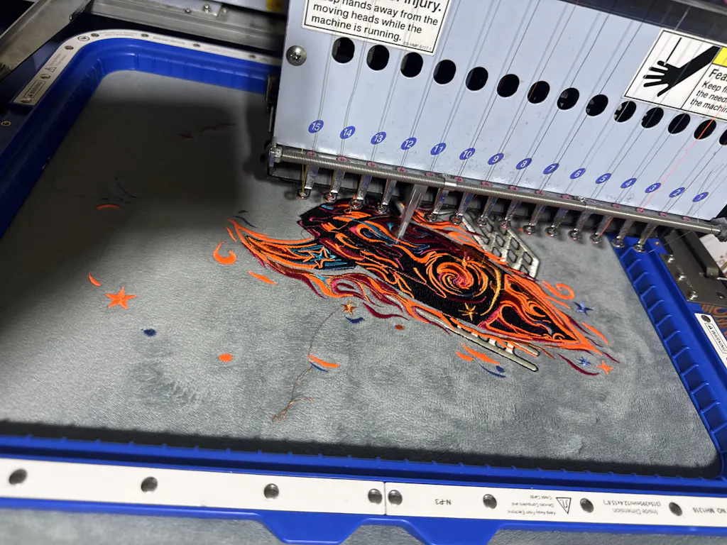
7. Machine Embroidery Solutions for Names
Machine embroidery opens up a world of crisp, professional name stitching—if you know how to harness its digital power. While hand embroidery lets you pour personality into every stitch, machine embroidery demands a different kind of artistry: smart digitizing, precise stabilization, and tension mastery. Let’s dive into the essentials for flawless machine-embroidered names, bridging the gap left by most high-ranking guides.
7.1 Digitizing Fonts and Tension Mastery
Choose Fonts That Shine in Thread, Not Just on Screen
Not all fonts are created equal—especially when you’re trading pixels for stitches. For machine embroidery, prioritize sans-serif and block fonts like Copperplate Gothic Bold or Rockwell. These styles offer clarity, avoid thread clumping, and maintain legibility even at smaller sizes. Intricate or ultra-thin fonts may look elegant in print but often turn into a tangled mess when stitched, especially on dense or textured fabrics.
Digitizing: Where Art Meets Engineering
- Pre-digitized Fonts: Take advantage of digitizing software for embroidery machines like SewWrite, Hatch, or Wilcom, which offer extensive libraries of ready-to-stitch fonts. These are optimized for machine use, saving you hours of trial and error.
- Manual Digitizing: For custom or branded fonts, import your TTF/OTF files into software such as Brother PE-Design. Trace your design into vectors, then manually plot stitch paths. Pro tip: Always design at a larger size and scale down for best results—this helps preserve detail and prevents distortion.
- Testing is Non-Negotiable: Simulate your design in the software, then stitch a test run on scrap fabric. This is your safety net—catching issues like thread breaks, density overload, or illegible details before they hit your main project.
Stabilization: The Unsung Hero of Machine Lettering
The right stabilizer makes or breaks your embroidery—literally. Here’s a quick reference:
| Fabric Type | Stabilizer Type | Underlay Strategy |
|---|---|---|
| Lightweight cotton | Cut-away | Running stitch |
| Thick denim | Tear-away | Zigzag stitch |
| Fleece | Water-soluble | Satin stitch |
- Prevent Puckering: Use cut-away stabilizers for stretchy knits and tear-away for rigid fabrics. For sheer or delicate fabrics, a water-soluble stabilizer keeps your stitches crisp and visible.
Thread Tension & Machine Calibration: The Balancing Act
- Balanced Tension: Adjust thread tension to match your fabric—looser for delicate materials, tighter for heavyweights. Always test on a scrap before starting your actual project.
- Speed Matters: Slow your machine down for small, intricate text. This reduces thread breaks and ensures cleaner, more defined letters.
- Stitch Sequencing Workflow: Follow this order for optimal results: 1. Placement stitches 2. Underlay 3. Top stitches 4. Small details
Pro Tips for Flawless Results
- Font Testing: Always validate your chosen font in your embroidery software. Some fonts may look great on screen but stitch poorly due to density or pathing issues.
- Customize for Fabric: Adjust stitch density and underlay type based on the fabric you’re using. This level of customization is what separates hobbyists from pros.
- Leverage Pre-digitized Libraries: Built-in font libraries (like those in Hatch or Wilcom) are optimized for machine embroidery and can dramatically speed up your workflow.
Troubleshooting Small Lettering
Machine embroidery has its limits—especially with tiny text. A stitch needs to be at least 1mm long to be visible and avoid shredding fabric. If you’re struggling with small letters:
- Switch to thinner threads (e.g., 60-weight instead of standard 40-weight).
- Use a smaller needle (size 9 or 10, microtex or ballpoint for knits).
- Always use a water-soluble topping on knits to prevent stitches from sinking in.
- Avoid resizing fonts below manufacturer recommendations.
Bottom Line: Machine-embroidered names can look as sharp as a business card—if you respect the rules of digitizing, stabilization, and tension. Test, tweak, and don’t be afraid to reject a font that doesn’t play nice with thread. Your embroidery machine is a precision tool; treat it like one, and your lettering will sing.
8. Conclusion: Elevating Your Lettering Craft
Mastering name embroidery is a journey that blends technique, creativity, and thoughtful material choices. Whether you’re hand-stitching curves with care or digitizing fonts for machine precision, the keys to flawless lettering remain the same: choose stitches that suit your style, match threads and fabrics wisely, and never underestimate the power of proper stabilization. Practice on swatches before tackling complex projects, and remember—the heart you put into personalization transforms every piece into a lasting treasure.
9. Frequently Asked Questions
9.1 Q: What is the minimum recommended font size for machine or hand-embroidered lettering?
A: For best results, keep your lettering at least 10mm (about 0.4 inches) high. Smaller fonts may lose clarity, especially with machine embroidery, as stitches can blend together or distort the fabric.
9.2 Q: How do I fix puckered satin stitch in my lettering?
A: Puckering often results from improper stabilization or excessive stitch density. Use a cut-away stabilizer for stretchy or delicate fabrics, and adjust your stitch density in your embroidery software or by hand. Test on a scrap before committing to your main project.
9.3 Q: What’s the safest way to remove water-soluble marker lines after stitching?
A: Avoid heat—never iron over water-soluble marks, as heat can set them permanently. Instead, use cold water to rinse or dab with a damp cloth or sponge paintbrush. This lifts the ink without spreading it or damaging your embroidery. Always test on a fabric scrap first to ensure complete removal.
Ready to take your name embroidery to the next level? Experiment, practice, and let every stitch tell your story.