1. Introduction to Lettering Logo Design Essentials
Lettering logos are more than just stylized text—they're the heartbeat of a brand's identity, instantly conveying personality, values, and professionalism. Whether you’re drawn to the flowing script of Coca-Cola or the minimalist clarity of Apple, the power of a well-crafted lettering logo is undeniable. At their core, impactful lettering logos rely on three pillars: simplicity, scalability, and relevance. The design journey typically unfolds in stages—researching brand values, sketching concepts, digitizing artwork, refining with software, and rigorous testing for real-world adaptability. In this guide, we’ll unpack trending styles, compare top design tools, and reveal pro techniques to help you master every step of the process. Ready to transform your ideas into logos that leave a lasting mark? Let’s dive in.
Table of Contents
- 1. Introduction to Lettering Logo Design Essentials
- 2. Design Principles for Impactful Lettering Logos
- 3. Trends and Inspiration: Sparking Creativity
- 4. Specialized Techniques: Folded, Hand-Drawn & 3D Effects
- 5. Tool Comparison: Illustrator vs. Procreate vs. Canva
- 6. Refinement Strategies: Kerning, Strokes, and Feedback
- 7. Client Applications: Scalability and Brand Ecosystems
- 8. Conclusion: Crafting Timeless Lettering Logos
- 9. FAQ: Lettering Logo Design Essentials
2. Design Principles for Impactful Lettering Logos
Creating a lettering logo is both an art and a science. It’s about capturing a brand’s essence in a single, memorable mark—one that stands the test of time and adapts seamlessly across platforms. Let’s break down the principles and technical strategies that separate amateur attempts from professional masterpieces.
2.1 Core Foundations: Legibility and Brand Alignment
Simplicity, originality, and timelessness are the cornerstones of effective lettering logos. Think of Coca-Cola’s iconic script—its clean, flowing lines have remained instantly recognizable for generations. Or consider Apple’s logo, which embodies innovation and knowledge through its elegant minimalism. These examples show how simplicity ensures legibility at any size, while originality prevents confusion with competitors.
But there’s a delicate dance between creativity and brand alignment. Your design choices—whether playful curves or geometric precision—must reflect the brand’s values and resonate with its audience. For instance, a children’s app might embrace lively, organic shapes, while a financial firm could opt for sharp, structured letterforms. Staying true to the brand’s voice ensures the logo feels authentic, not forced.
Timelessness means resisting fleeting trends in favor of enduring appeal. While it’s tempting to chase what’s hot, the most successful logos remain relevant for decades by focusing on universal design principles. Before you commit, ask: Will this logo still make sense five, ten, or twenty years from now?
2.2 Technical Execution: Scaling and Adaptability
A beautiful logo is only as strong as its weakest application. Scalability is crucial—your design must shine whether it’s on a billboard or a business card. Start by testing your logo in monochrome and at small sizes to ensure every detail remains clear. Avoid intricate flourishes that could blur or vanish when scaled down.
Consistency across platforms is another must. A logo that looks sharp on a website but falls apart on packaging or social media undermines brand trust. Use vector-based tools like Adobe Illustrator or Procreate to maintain crisp lines and flexible sizing.
Beware of overcomplication—a common pitfall. While it’s tempting to add layers of detail or trendy effects, these can quickly clutter your design and reduce legibility. Remember: less is often more. Focus on strong, balanced forms and harmonious spacing to create a logo that’s both striking and versatile.
3. Trends and Inspiration: Sparking Creativity
The world of lettering logo design is constantly evolving, with fresh styles and cultural influences shaping what’s possible. Whether you’re seeking inspiration or aiming to set the next trend, understanding the current landscape is key.
3.1 2025 Styles: Minimalism, Retro, and Eco-Design
Looking ahead to 2025, several styles are leading the creative charge:
- Minimalism & Simplicity: Clean lines, monochrome palettes, and uncluttered shapes dominate digital-first branding. Brands like TikTok and Clubhouse leverage minimalist logos for instant recognition across devices.
- Custom Typography: Bespoke fonts and unique letterforms help brands stand out. Intervened typography—where designers add personal flourishes—creates logos that feel tailored and memorable.
- Retro Revival: Art Deco and Y2K influences are merging with modern minimalism. Expect geometric patterns, gold accents, and vintage-inspired type that blend nostalgia with contemporary flair.
- Eco-Conscious Design: Organic shapes, earthy colors, and natural motifs (think flowing water or leaves) are gaining traction, especially with Gen Z’s focus on sustainability.
Platforms like Dribbble and 99designs showcase these trends in action, offering a treasure trove of visual references. And with 72% of consumers judging brand credibility by logos, intentional design is more important than ever.
3.2 Style Deep Dives: Brush, Flat, and Vintage Techniques
Let’s zoom in on three popular lettering styles—and the tools that bring them to life:
- Brush Lettering: Characterized by fluid strokes and handcrafted imperfections, brush lettering exudes warmth and personality. Procreate’s brush tools are favorites for mimicking traditional ink effects, while Illustrator helps refine curves for optical balance. Tutorials often stress aligning details to grids and maintaining consistent weight, as seen in critiques of playful, expressive logos.
- Flat Design: This style strips away gradients and shadows, focusing on solid colors and geometric forms. Minimalist sans-serif fonts pair with simple icons for maximum versatility—a staple in digital interfaces. Adobe Illustrator and platforms like Wix Logo Maker offer templates and tools for quick, clean results.
- Vintage Typography: From Art Deco’s luxurious geometry to Art Nouveau’s organic lines, vintage styles evoke a sense of history and craftsmanship. Procreate’s specialty brushes and curated font libraries make it easy to experiment with calligraphic strokes or ornate borders. Retro influences—like 1920s metallic accents or Y2K neon—add a layer of cultural storytelling.
For hands-on learning, YouTube tutorials and design communities provide step-by-step guides and critiques, helping you hone your technique and avoid common pitfalls. Whether you’re sketching with pencil and paper or refining digital vectors, the key is to experiment boldly—then refine ruthlessly.
---
Ready to create a logo that’s both timeless and on-trend? Explore, experiment, and let your creativity flow—you might just set the next design standard.
4. Specialized Techniques: Folded, Hand-Drawn & 3D Effects
Lettering logo design is a playground for creative experimentation, but each style—folded, hand-drawn, or 3D—demands its own unique workflow and troubleshooting mindset. Let’s peel back the layers on these specialized techniques, highlighting practical steps, common pitfalls, and expert fixes that transform a good logo into a showstopper.
4.1 Style-Specific Workflows and Troubleshooting
Folded Lettering: Creating Dimensional Depth
Folded lettering mimics the look of paper or ribbon bending through space, delivering a bold, tactile effect that leaps off the screen. The workflow usually starts in Adobe Illustrator:
- Path Manipulation: Begin by sketching your letter with the Rectangle or Pen tool. Maintain consistent thickness by duplicating your base shape for each segment—this keeps your folds uniform.
- Gradient & Shadow Layering: Select the top anchor points of your shape and shift them to create the illusion of a fold. Reflect and align shapes for symmetry. Add gradients—darker at the bottom, lighter at the top—to simulate depth, and use low-opacity black shapes (about 30% opacity) between layers for shadow effects.
- Alignment Tools: Use Smart Guides and the Align panel to ensure every segment lines up perfectly, avoiding awkward overlaps or misaligned folds.
Troubleshooting:
- If your folds look flat, experiment with gradient direction and shadow placement. Overcomplicating folds with too many layers can muddy the letterform—simplify where possible and test in monochrome to ensure clarity.
- For versatility, create multiple versions: a gradient-rich primary, a flat CMYK for print, and a single-color mono for small-scale use.
Inspired by Satori Graphics’ tutorial, these steps let you build folded logos that combine visual intrigue with professional polish.
Hand-Drawn Lettering: Organic Personality
Hand-drawn logos channel warmth, authenticity, and a human touch. The workflow blends analog sketching with digital refinement:
- Sketch & Ink: Start with pencil and paper, focusing on the brand’s personality. Trace over your sketch with ink to lock in the final shapes.
- Digital Transfer: Import your sketch into Procreate or Illustrator. Use brush tools to trace the letters, introducing intentional imperfections—varying stroke weights and organic curves add character.
- Hybrid Typography: Mix hand-drawn elements with geometric shapes for a balanced, modern look.
Troubleshooting:
- Over-Complexity: Too many flourishes or decorative elements can overwhelm the core letterforms. Simplify by stripping back to essential shapes.
- Legibility Loss: Test your design at small sizes; if details vanish or letters blur together, thicken strokes and increase spacing.
- Stroke Consistency: Maintain uniformity in line width. Inconsistencies can make the logo feel amateurish—use guides and digital tools to standardize where needed.
YouTube critiques and Dribbble showcases reveal that the best hand-drawn logos are both expressive and meticulously refined, never sacrificing readability for style.
3D Effects: Bringing Letters to Life
3D lettering transforms flat text into sculptural forms, adding drama and depth:
- Gradient & Shadow Layering: Use Illustrator’s radial gradients and drop shadows to create the illusion of volume.
- Extrusion Tools: Apply the Extrude & Bevel effect to add physical depth, or use 3D software for advanced modeling.
- Material Textures: Overlay metallic or matte finishes using gradient maps for added realism.
Troubleshooting:
- Over-Rendering: Too much detail can obscure the letter’s shape. Focus on clear silhouettes and limit the number of effects.
- Color Clashes: Make sure your 3D embellishments complement the logo’s primary palette. Avoid letting shadows or highlights overpower the core design.
The key is restraint—let the 3D effect enhance, not dominate, your lettering.
4.2 Fixing Common Flaws: Spacing, Color, and Testing
No matter how stylish your logo, technical flaws can undermine its impact. Here’s how to spot and fix the most common issues:
| Issue | Solution |
|---|---|
| Uneven Letter Spacing | Adjust tracking (overall spacing) or kerning (pair-specific) to balance gaps between characters. |
| Negative Space Misuse | Sketch out concepts to ensure hidden imagery (like arrows or icons) aligns with letter structure. |
| Color Inconsistency | Develop a color system with primary, secondary, and mono versions for cross-platform compatibility. |
| Lack of Scalability | Use vector tools (e.g., Illustrator) to ensure logos remain crisp at all sizes. |
Kerning and Spacing
Kerning—adjusting space between specific letter pairs—is critical. For example, the “A” and “V” pair often needs tighter spacing due to their angled forms. Use Illustrator’s kerning tools and test at various sizes to ensure visual balance. Over-kerning (too tight) or under-kerning (too loose) can both harm legibility.
Negative Space
Strategically use negative space to embed hidden elements or reinforce brand storytelling. Sketch and test to make sure these elements are visible and don’t confuse the letterforms.
Color Consistency
Establish a palette with primary, secondary, and monochrome versions. This ensures your logo looks sharp on everything from business cards to billboards.
Vector Workflow Best Practices
- Always finalize your logo in vector format for infinite scalability.
- Maintain version control—save RGB, CMYK, and mono files for different applications.
Pro tip: Minimalist, bold typography with strategic spacing aligns with modern trends, while hybrid aesthetics (classic meets geometric) create unique brand identities.
5. Tool Comparison: Illustrator vs. Procreate vs. Canva
Choosing the right design tool can make or break your lettering logo workflow. Each platform—Illustrator, Procreate, and Canva—caters to different needs, skill levels, and output requirements. Let’s break down the strengths, limitations, and ideal use cases for each.
5.1 Efficiency and Output Quality Analysis
Adobe Illustrator: The Vector Powerhouse
- Efficiency: Illustrator is built for professional workflows. Its vector-based editing allows precise control over shapes, colors, and typography. Integration with Adobe Creative Cloud means seamless collaboration and cross-app functionality.
- Output Quality: Logos designed in Illustrator are infinitely scalable—no matter how large or small, your design stays crisp and clear. Advanced typography tools (variable fonts, kerning, path manipulation) and access to 20,000+ Adobe Fonts make it a top choice for custom lettering.
Best for:
- Corporate logos, signage, and any application where precision and scalability are non-negotiable.
Procreate: The Hand-Drawn Specialist
- Efficiency: Procreate is a dream for iPad users, streamlining hand-drawn and raster-based workflows. Features like Hover (on M2 iPad Pros) and double-tap shortcuts boost speed and accuracy, though it lacks native vector tools.
- Output Quality: Optimized for high-resolution digital art, Procreate excels at organic textures and natural brushwork. However, since it’s raster-based, scaling up can lead to pixelation—less ideal for large-format print.
Best for:
- Boutique brands, creative startups, and anyone prioritizing hand-drawn, artistic styles.
Canva: The Rapid Prototyper
- Efficiency: Canva’s drag-and-drop templates, AI-powered suggestions, and pre-built assets make it the fastest way to mock up a logo. Its collaborative features and cloud storage are perfect for teams or social media-focused projects.
- Output Quality: Canva is raster-based with fixed-resolution outputs, limiting its suitability for print or large-scale use. Customization options are also more limited compared to Illustrator or Procreate.
Best for:
- Quick social media graphics, rapid prototyping, and non-designers needing a simple, collaborative tool.
| Tool | Workflow Efficiency | Output Quality | Best For |
|---|---|---|---|
| Illustrator | Professional, precise | Infinite scalability (vector) | Corporate, signage, high-res print |
| Procreate | Fast, intuitive (iPad) | High-res raster, organic textures | Hand-drawn, boutique, creative |
| Canva | Fastest, template-driven | Fixed-res raster, limited vectors | Social media, rapid mockups |
5.2 Learning Curves and Cost Considerations
| Tool | Ease of Use | Key Challenges | Cost | Best For |
|---|---|---|---|---|
| Canva | Easiest; intuitive for non-designers | Limited customization, no vector editing | Free; Pro: $12.99/month | Budget users, quick collaboration |
| Procreate | Moderate; intuitive for artists | Requires iPad/Apple Pencil, learning curve for non-artists | One-time: $12.99 | iPad artists, hand-drawn workflows |
| Illustrator | Steep; professional training recommended | Complex interface, advanced features | $22.99/month (individual) | Professionals, industry-standard workflows |
Recommendations:
- Illustrator: Choose when you need scalable, precise logos and advanced typography.
- Procreate: Ideal for affordable, organic, hand-drawn lettering.
- Canva: Great for fast, collaborative drafts—just be aware of output limitations.
6. Refinement Strategies: Kerning, Strokes, and Feedback
Once your logo’s basic form is set, true mastery lies in the details—kerning, stroke consistency, and iterative feedback. These elements separate amateur drafts from polished, professional marks.
6.1 Expert Critique Framework: Balancing Form and Function
Kerning: The Art of Spacing
Kerning is the subtle adjustment of space between letter pairs to achieve visual harmony. For example, the “A” and “V” pair often needs tighter spacing due to their diagonal forms. Over-kerning (too tight) or inconsistent spacing can make a logo feel awkward or hard to read.
Best Practices:- Apply kerning after finalizing font size, especially for logos used at multiple scales.
- Use system fonts or foundry-typefaces with optimized default spacing as a starting point.
- Test at various sizes to ensure readability remains intact.
Stroke Consistency: Cohesion in Hand-Lettered Logos
Uniform line width and flow are critical for both readability and aesthetic cohesion. Inconsistent thick and thin strokes can make a logo appear cluttered or amateurish.
Pro Tips:- Use digital tools like Procreate or Illustrator’s pen tools to standardize strokes.
- Maintain proportional relationships (e.g., consistent ratio of thick to thin lines) for scalability.
- Test at small and large sizes to ensure clarity.
Negative Space: Hidden Stories
Negative space is the unoccupied area around and within letterforms, often used to embed hidden elements or reinforce symbolism. The classic FedEx logo, with its hidden arrow, is a masterclass in negative space storytelling.
Techniques:- Enclose negative space on three sides with positive elements to clarify hidden shapes.
- Integrate negative space within or between letters for subtle brand cues.
- Validate with user testing—make sure the hidden element is perceived as intended.
6.2 Testing and Iteration: Ensuring Cross-Platform Integrity
A logo’s journey doesn’t end with the first draft. Systematic testing and feedback loops are essential for cross-platform excellence.
| Element | Testing Method | Tools/Resources |
|---|---|---|
| Kerning | A/B testing with varied font sizes | Illustrator, Canva |
| Stroke Consistency | Small-scale readability checks | Procreate, Vector Tools |
| Negative Space | User surveys for hidden element recognition | Figma, UserTesting |
- Stakeholder Input: Gather feedback focused on brand objectives—does the logo evoke the desired emotion? Is it memorable?
- Documentation: Track each iteration with notes (e.g., “Tightened ‘A-V’ spacing for readability”), justifying design decisions for future reference.
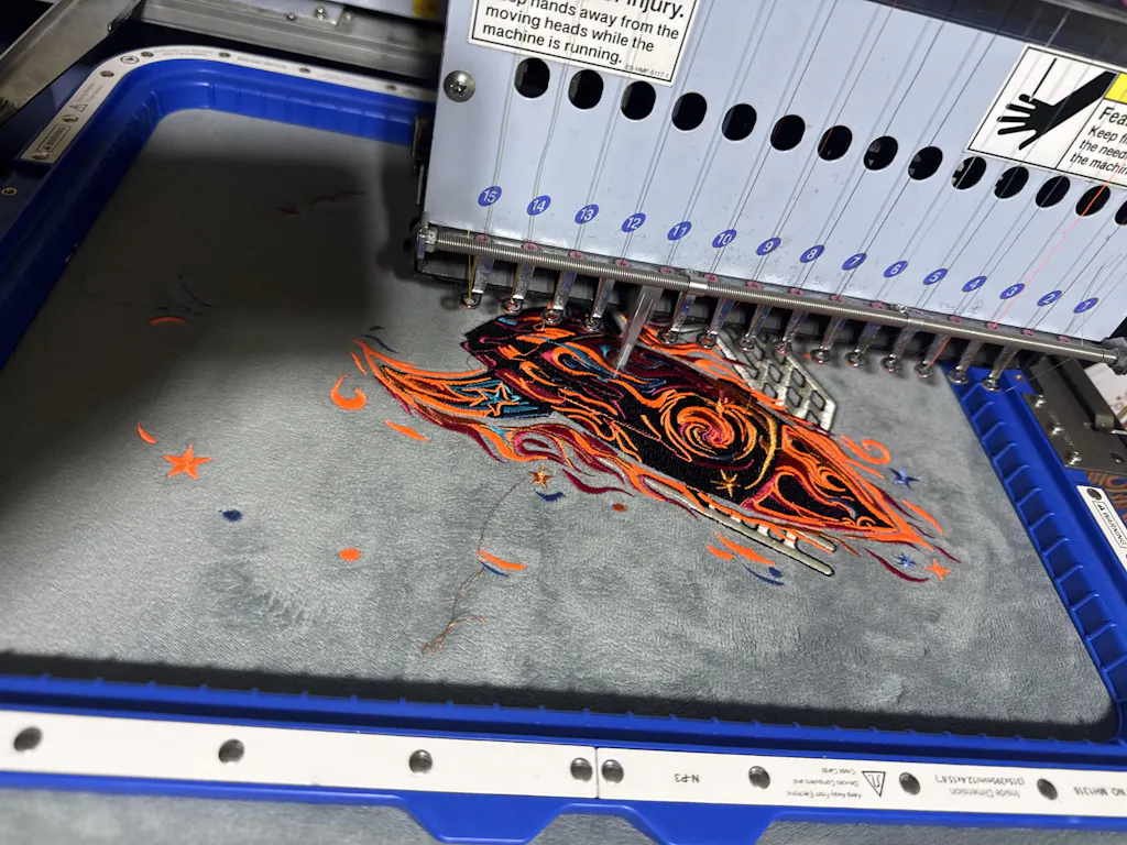
Embroidery Efficiency Note
When preparing logos for garment embroidery, efficient design is key. Specialized embroidery machine software like Sewtalent’s solutions ensures durability and precision in logo translation—maintaining clarity, minimizing thread breaks, and upholding your brand’s integrity across every stitch.
With these advanced strategies, your lettering logo will not only look stunning on screen but also perform flawlessly in the real world—whether it’s printed, embroidered, or displayed on the smallest mobile device. Now, take your design from “almost” to “absolutely unforgettable.”
7. Client Applications: Scalability and Brand Ecosystems
Lettering logos aren’t just art—they’re workhorses for your brand, expected to look flawless everywhere from Instagram icons to embroidered uniforms. But here’s the challenge: what dazzles on a digital mockup can fall flat on a T-shirt or blur into oblivion on a tiny app icon. The secret to a logo that thrives across every touchpoint? Scalability, clarity, and a deep understanding of real-world constraints.
Adapting for Merchandise and Social Media
Let’s start with the basics: vector graphics are your best friend. Tools like Adobe Illustrator empower you to scale your logo infinitely, ensuring crisp lines whether you’re printing a billboard or a business card. But don’t let creative flourishes sabotage function—overly intricate details can vanish at small sizes, undermining legibility. In fact, research shows that 75% of consumers recognize brands by visual identity alone, so clarity is non-negotiable.
When prepping a logo for social media, stick to the minimum digital size standard of 36px tall. For print, never go below 3/4 inch in height. This keeps your logo visible, even in the crowded world of profile pics and promotional swag.
Clear space is another must. Maintain a buffer zone around your logo—typically the x-height of your lettering—to prevent visual clutter and ensure your design stands out, no matter the background. Predefined color combinations and high-contrast palettes bolster readability, especially on screens and in low-light environments.
Navigating Material Constraints
Physical merchandise brings its own set of hurdles. Embroidered logos, for example, demand simplicity and boldness—fine lines and subtle gradients often get lost in translation. Here, fabric durability becomes a key player. Specialized embroidery machines like Sewtalent’s solutions preserve logo clarity across garments.
Brand Alignment and Consistency
Consistency is king. Use the same typeface (with varied weights for names and taglines) and stick to your brand’s color palette across all applications. This not only reinforces recognition—brands with adaptable logos see 30% higher customer engagement—but also keeps your visual identity cohesive as your brand grows.
Real-World Testing and Feedback
Don’t just trust your screen—simulate real-world use cases. Resize, invert colors, and test your logo on different backgrounds and materials. Iterative feedback loops, including client presentations and user surveys, help catch issues early and ensure your logo resonates with your audience.
Action Steps for Designers
- Always design in vector format.
- Test at minimum sizes: 36px digital, 3/4 inch print.
- Maintain clear space: At least the x-height of your logo’s text.
- Simplify for embroidery and merchandise.
- Enforce usage guidelines: No unauthorized modifications or color swaps.
By mastering these strategies, your lettering logo will not only look stunning on screen but also shine in the real world—across every channel, product, and brand ecosystem.
8. Conclusion: Crafting Timeless Lettering Logos
Mastering lettering logo design is about more than style—it’s a commitment to clarity, adaptability, and brand storytelling. Simplicity anchors your design, while tool mastery and iterative testing ensure it thrives across platforms and materials. The most enduring logos balance trend awareness with practical function, never sacrificing legibility for flair. As you experiment with the techniques and workflows explored throughout this guide, remember: every great logo starts with curiosity and evolves through refinement. Keep pushing boundaries, keep testing, and let your creativity define the next chapter of visual identity.
根据任务要求和跳过规则,用户提供的选择题信息中: - 问题部分只有标题"#问题:"而无具体内容 - 所有选项字段均明确标记为"空" - 所有"是否为正确选项"字段也标记为"空" 这属于题目信息为空的情况。根据规则: > 如果用户提供的选择题信息为空或表示无内容,则输出一个空格" " 因此输出结果为: `` (实际输出为一个空格字符)9. FAQ: Lettering Logo Design Essentials
9.1 Q: What’s the best software for beginners to design lettering logos?
A: Canva and Procreate are excellent starting points. Canva offers intuitive, template-driven workflows ideal for quick drafts and social media graphics, while Procreate provides a more hands-on, artistic approach for hand-drawn styles. Both are accessible and user-friendly for newcomers.
9.2 Q: How can I test if my logo scales well across different media?
A: Print previews and digital mockups are your best tools. Test your logo at the smallest intended size (like 36px for digital or 3/4 inch for print) and in monochrome to ensure all details remain clear and legible. Iterative resizing and feedback from real users can reveal hidden issues.
9.3 Q: Should I use hand-lettering or fonts for my logo?
A: Hand-lettering offers originality and a unique brand voice, but requires more time and skill to execute cleanly. Fonts provide consistency and speed, but may lack that bespoke character. The choice depends on your brand’s personality and the level of distinctiveness you want to achieve. Consider blending both for a hybrid approach.
Ready to create a logo that works everywhere? Apply these principles, experiment boldly, and watch your brand identity come alive—on screen, in print, and beyond.
根据任务规则,用户提供的问题和选项内容均为空(问题未填写,选项及其说明、正确性判断均为空)。因此按照跳过规则输出一个空格。