1. Introduction: Unlocking Creativity with Embroidered Letters
Personalized embroidery lettering is like the secret ingredient that transforms everyday items into cherished keepsakes. Whether you’re stitching a monogram onto a crisp handkerchief, adding a whimsical quote to a tote, or crafting a heartfelt gift, embroidered letters offer endless opportunities for creative self-expression. This guide will walk you through everything you need to know: where to find free letter patterns, which stitches make your words pop, how to choose fonts, and what materials deliver the best results. Master these skills, and you’ll elevate your embroidery projects from simple to spectacular—one letter at a time.
Table of Contents
- 1. Introduction: Unlocking Creativity with Embroidered Letters
- 2. Finding Free and Downloadable Embroidery Letter Patterns
- 3. Essential Hand Embroidery Stitches for Lettering Mastery
- 4. Choosing Fonts and Styles for Impactful Embroidered Letters
- 5. Personalized Embroidery Projects: From Inspiration to Creation
- 6. Selecting Materials for Flawless Letter Embroidery
- 7. Advanced Techniques for Professional Lettering Results
- 8. Conclusion: Your Path to Embroidered Lettering Excellence
- 9. FAQ: Embroidered Lettering Questions Answered
2. Finding Free and Downloadable Embroidery Letter Patterns
Unlocking the world of embroidered lettering starts with finding the perfect pattern. Fortunately, the digital embroidery community is overflowing with resources—no matter your style, skill level, or project type.
2.1 Top Digital Platforms for Free Alphabets
When it comes to sourcing free embroidery letter patterns, a few standout platforms consistently top the list:
- AnnTheGran.com boasts the largest free collection of alphabet embroidery designs, including free embroidery patterns for embroidery machine. Here, you’ll find a vast array of styles, from classic to contemporary, all organized for easy browsing. Whether you’re searching for a bold block font or a delicate script, AnnTheGran’s library is a goldmine for both machine and hand embroidery enthusiasts.
- EmbroideryDesigns.com offers free sample characters from popular home embroidery fonts. This preview-before-you-download approach is perfect for evaluating font style and compatibility before committing to a full set. The platform supports a wide range of file formats—including ART, DST, EXP, HUS, JEF, PEC, PES, SEW, VIP, VP3, and XXX—ensuring compatibility with most embroidery machines.
- DMC’s “Stitch Alphabet” is a must-see for hand embroiderers. This curated pattern features twenty-six unique letters and nearly 30 different stitches, making it a fantastic sampler for developing your embroidery skills. DMC’s patterns are known for their clarity and quality, and their colorfast threads keep your work vibrant for years.
When choosing a pattern, pay attention to file formats and hoop compatibility. Most free collections cater to standard hoop sizes—like 4" x 4" and 5" x 7"—making it easy to match your pattern to your machine or hand embroidery frame.
2.2 Specialized Collections: Floral, Vintage, and Seasonal Styles
If you crave something beyond the basics, niche resources and themed collections open up even more possibilities:
- Antique Pattern Library is a treasure trove for those seeking historical or vintage-inspired designs. Here, you’ll find public domain patterns like “Dessins de Broderie No. 665” and “Album d'Alphabets et Monogrammes,” perfect for projects that call for a touch of old-world elegance or cohesive visual themes.
- Floral, Crewel, and Appliqué Alphabets abound in free pattern libraries. Floral uppercase letters, for example, weave botanical motifs into traditional letterforms—ideal for garden-inspired gifts or feminine décor. Crewel monograms, with their flowing lines and organic shapes, offer a nod to embroidery’s rich heritage.
- Seasonal and Holiday Patterns are also widely available. Think Christmas lights, autumn leaves, or spring blossoms—these themed alphabets add a playful, timely twist to kitchen towels, baby blankets, and holiday décor.
- Pinterest and similar platforms serve as discovery engines, curating collections from across the web and surfacing community favorites. Search for “free embroidery letter patterns” to find everything from modern minimalism to ornate vintage scripts.
2.3 Quality Tips and Download Best Practices
With so many patterns at your fingertips, how do you choose the best and avoid common pitfalls?
- Check Design Specifications: Look for details like stitch density and recommended sizing. High-quality patterns will specify these elements, helping you avoid issues like puckering or unreadable letters.
- Filter by Complexity and Hoop Size: Many platforms allow you to sort patterns by difficulty level and compatible hoop size. This is especially helpful if you’re working with a smaller frame or just starting out.
- Preview Before Downloading: Platforms like EmbroideryDesigns.com let you view sample characters, ensuring the font’s style and legibility match your vision.
- Leverage Community Wisdom: Pinterest boards and embroidery forums often highlight tried-and-true favorites, complete with user reviews and finished project photos.
- Combine Free and Premium Resources: Don’t be afraid to mix and match. Many sites offer a blend of complimentary and premium patterns, allowing you to customize your project while staying within budget.
By following these tips and exploring reputable sources, you’ll build a pattern library that’s as unique as your creative vision—ready to personalize gifts, décor, and keepsakes for any occasion.
3. Essential Hand Embroidery Stitches for Lettering Mastery
The magic of embroidered lettering lies not just in the pattern, but in how you bring each letter to life with needle and thread. Let’s break down the essential stitches that form the backbone of beautiful, readable, and expressive embroidered letters.
3.1 Core Outline Stitches: Back, Stem, and Split Stitch
Back Stitch: The back stitch is the workhorse of letter embroidery—simple, precise, and universally adaptable. It creates a slightly textured, segmented line that excels at outlining both script and printed fonts. To work a back stitch, make a single stitch, then bring your needle up one stitch length ahead and return to the endpoint of the previous stitch. This technique is especially effective for small, delicate letters and can even be used as a filler for thicker sections using a brick pattern approach. Pro tip: For smooth curves, shorten your stitch length as you round the bend.
Stem Stitch: If you want your letters to flow like cursive handwriting, stem stitch is your go-to. This technique produces a twisted, rope-like line that’s perfect for script fonts and elegant monograms. Bring your needle up just beside the previous stitch, always keeping your thread on the same side (outside of the curve), and watch as your letters take on a dimensional, vine-like quality. Stem stitch is especially forgiving on curves and adds a sophisticated touch to any project.
Split Stitch: For smooth, braid-like outlines, the split stitch is a favorite among seasoned embroiderers. Here, each new stitch splits the previous one, creating a seamless, plaited texture. This technique shines on curved or intricate letterforms, allowing for graceful transitions and refined finishes. It’s also less bulky on the fabric’s reverse side, making it a smart choice for layered designs.
Tips from the Pros:
- Shorter stitches yield smoother curves and sharper corners.
- Plan your stitch path before you start—embroidery isn’t handwriting, and doubling back can create unwanted bulk.
- Always end your thread before starting a new letter to avoid visible “thread shadows,” unless you’re working with connected script fonts.
3.2 Decorative Techniques: Chain Stitch and Whipped Variations
Chain Stitch: Looking for bold, textured letters? Chain stitch is your answer. This technique links a series of loops, forming a chunky, decorative line that stands out on larger letters or display fonts. Chain stitch can be used for both outlining and filling, and its natural thickness often eliminates the need for multiple thread strands. Just be mindful of tension—too tight, and you’ll lose the signature chain effect.
Whipped Running and Whipped Back Stitch: For a refined, polished finish, try whipping your stitches. Start with a basic running or back stitch, then slide a contrasting thread under each stitch to create a smooth, rope-like line. This method adds thickness and texture, making your letters pop without overwhelming the design. It’s a favorite for adding subtle dimension or extra color to monograms and quotes.
Textured Finishes: Inspired by CleverPoppy.co.uk and YouTube tutorials, experiment with combining these techniques for added interest. Use chain stitch for outlines, then whip with a metallic or variegated thread for a playful twist. Or, pair split stitch outlines with chain stitch fills for a dynamic, layered look.
3.3 Filling Letters: Satin Stitch and Beyond
Satin Stitch: The satin stitch is the classic choice for filling large letters or thick sections. It creates a smooth, glossy surface that catches the light and makes your lettering truly shine. The key to flawless satin stitch? Consistent direction and tension. Always work from one side of the letter to the other, keeping your stitches parallel and snug—but not too tight, to avoid puckering.
Long-and-Short Stitch: For gradient effects or a painterly touch, the long-and-short stitch offers beautiful shading and texture. Alternate long and short stitches within the letter, blending colors as you go for a seamless transition. This technique is ideal for creating 3D effects or adding depth to decorative initials.
Other Creative Fills:
- French Knots: Add playful dots or textured fills to thicker letters.
- Brick Stitch: Offset rows of back stitches for a “brick wall” effect—great for chunky display fonts.
- Couching and Appliqué: Lay down a bold thread and secure it with small stitches, or combine fabric pieces with embroidered details for dimensional lettering.
Guidelines for Success:
- Outline your letters first for crisp edges.
- Use 3–6 strands of floss for bold fills, 1–2 strands for fine details.
- Practice on scrap fabric to perfect your technique and tension.
With these stitches in your toolkit, you’re ready to tackle any lettering project—from elegant monograms to playful quotes. Remember: every letter you embroider is a chance to experiment, refine your skills, and let your creativity shine. Now, pick your favorite pattern, thread your needle, and let your words come to life—one stitch at a time.
4. Choosing Fonts and Styles for Impactful Embroidered Letters
The font you choose for embroidered letters is more than just a style decision—it’s the bridge between your creative vision and a beautifully executed project. Fonts influence not only the look but also the readability and technical feasibility of your embroidery. Let’s unravel the art and science behind picking the perfect font for your next stitched masterpiece.
4.1 Font Types Explained: Sans-Serif vs. Script vs. Block
Selecting the right font type is like choosing the right thread—each brings its own character and challenges.
Sans-Serif Fonts:
Sans-serif fonts, such as Arial, Helvetica, Calibri, and Futura, are the unsung heroes of embroidery. Their clean lines and lack of decorative flourishes make them exceptionally readable and easy to stitch. Helvetica, in particular, is celebrated for its versatility and crisp appearance, making it a go-to for projects where clarity is key. Modern sans-serifs like Gilroy and Gill Sans offer multiple weights and styles, adapting well to everything from casual hoodies to formal uniforms.
Script Fonts:
Script fonts—think flowing, cursive styles like Euphoria Script—add a touch of elegance and personality. They’re perfect for monograms, wedding linens, or any project where you want to evoke sophistication. However, script fonts require careful planning: their intricate curves and connecting lines can be tricky to execute, especially at smaller sizes. For best results, keep script letters at a minimum height of around 0.5 inches and use stitches like stem or split stitch to capture their graceful flow.
Block Fonts:
Block fonts, such as Antique Olive Nord and Boys Stacked, deliver bold statements with their thick, consistent strokes. These are ideal for standout projects—think varsity jackets, tote bags, or minimalist décor. Block fonts are forgiving on a variety of fabrics and maintain legibility even at smaller sizes (some, like Run Stitch block fonts, work at just 0.2 inches tall). Their structure also makes them suitable for filling techniques, such as satin or brick stitch, to create eye-catching, dimensional letters.
Size Matters:
Font size directly impacts legibility and stitchability. For example, Verdana remains crisp down to 0.25 inches, while more decorative scripts may need to be larger to avoid losing detail. Always test your chosen font at the intended size before committing to the full project.
4.2 Legibility and Fabric Compatibility Factors
A font that looks stunning on your screen might not translate seamlessly to fabric. Here’s how to ensure your stitched letters are both beautiful and readable:
Fabric Texture:
Smooth fabrics like cotton and linen are the dream canvas for most fonts, preserving sharp edges and fine details. On textured or nappy fabrics (think terry cloth or fleece), fine serifs and intricate scripts can disappear into the pile. For these surfaces, opt for bold, sans-serif or block fonts that won’t get lost in the weave.
Complexity of Serifs:
While serif fonts such as Times New Roman or Bodoni Terracina add classic charm, their tiny flourishes can become muddled on plush or uneven fabrics. TheSpruceCrafts.com recommends avoiding overly complex serifs for monograms on towels or other textured items—simple, bold styles will always outshine fussy details in these cases.
Project Context:
Consider the function and recipient of your project. A romantic script might be perfect for a wedding handkerchief, but a child’s backpack may call for playful, chunky letters. Always match the font’s personality to the item and its use.
Monogramming Tips:
For monograms, traditional styles often use three letters with the last name in the center. Keep in mind that clarity is paramount—choose fonts that maintain their shape and spacing, even when stitched tightly together.
4.3 Fonts to Avoid and Styling Inspiration
Not all fonts are created equal when it comes to embroidery. Some, while beautiful on paper, can become a tangled mess in thread.
Problematic Fonts:
Decorative fonts like Papyrus, Comic Sans, and Curlz MT are notorious for poor embroidered results. Their quirky curves and flourishes often translate into unreadable or chaotic stitches, especially at smaller sizes. Similarly, complex serif fonts like Old English or Blackadder tend to lose their intricate details in the stitching process, resulting in cluttered, hard-to-read letters.
Better Alternatives:
Instead, reach for time-tested options:
Sans-Serif: Helvetica, Gill Sans, Verdana
Serif: Times New Roman, Georgia, Garamond, Bodoni Terracina
Block: Antique Olive Nord, Boys Stacked, Diamond
Script: Euphoria Script (adapted for embroidery), Dancing Script, Great Vibes
Styling Inspiration:
Let your imagination run wild! Perplexity’s monogram categories showcase everything from garden heirloom florals and Christmas lights to retro motifs and butterfly-themed alphabets. Combine bold colors, geometric shapes, or vintage-inspired scripts to craft pieces that tell a story. For a modern twist, try mixing fonts within a single project—pair a bold block initial with a delicate script name for a look that’s both playful and sophisticated.
5. Personalized Embroidery Projects: From Inspiration to Creation
Personalized embroidery is where creativity and meaning intertwine—each project becomes a canvas for your story, your style, and your heart. Whether you’re crafting a gift or adding flair to your own space, the possibilities are as limitless as your imagination.
5.1 Trending Ideas: Monograms, Quotes, and Seasonal Themes
2025 is shaping up to be the year of bold statements and vibrant nostalgia in embroidery. Here’s what’s trending:
Monograms:
Monogrammed items remain the reigning champions of personalized embroidery. From classic three-letter arrangements on towels to single-initial accents on hats and bags, monograms never go out of style. The key for 2025? Go big and go bold—think chunky block letters or ornate scripts in eye-catching colors.
Inspirational Quotes:
Stitching favorite sayings or motivational words onto wall hangings, tote bags, or apparel transforms everyday objects into sources of daily encouragement. Play with font combinations and color palettes to make your message pop.
Seasonal and Themed Designs:
Retro motifs, geometric shapes, and playful patterns are making a comeback. Try garden heirloom florals for spring, Halloween alphabets for autumn, or Christmas lights for festive décor. Don’t shy away from mixing bright, fiery reds, sparkling blues, or cheerful yellows—2025 is all about color confidence.
Mixed Media Magic:
Combine thread with beads, sequins, or appliqué for a multidimensional look. Large side appliqués—like stars or butterflies—are especially popular, turning sweatshirts and tote bags into wearable art.
5.2 Gift and Décor Applications
Personalized embroidery transforms the ordinary into the extraordinary, making every gift and décor item feel one-of-a-kind.
Baby Blankets:
Soft, pastel letters stitched onto cozy blankets make cherished keepsakes for new arrivals. Try floral or animal-themed alphabets for extra whimsy.
Framed Quotes:
Turn meaningful words into wall art by embroidering them onto linen or cotton and displaying in a hoop or frame. Mix fonts and thread colors for visual interest.
Monogrammed Apparel:
Use an embroidery machine for hats and shirts to add initials to collars, cuffs, or jacket backs for a custom touch. Block fonts work well for bold statements, while script fonts add subtle elegance.
Kitchen Towels and Holiday Décor:
Personalized towels, napkins, and stockings are perennial favorites. Use seasonal patterns—like Christmas lights or autumn leaves—to create festive flair.
LoveCrafts.com Patterns:
Explore free and downloadable patterns for endless inspiration, from simple initials to elaborate themed alphabets. These resources make it easy to jumpstart your next project.
5.3 Overcoming Creative Blocks
Every stitcher hits a creative wall now and then. Here’s how to break through:
Brainstorming Techniques:
- Mood Boards: Collect images, color swatches, and font samples that spark joy.
- Pattern Mash-Ups: Combine elements from different patterns—like floral letters on tote bags or geometric initials on denim jackets.
- Theme Challenges: Set yourself a prompt (e.g., “summer fruits” or “vintage travel”) and see where it leads.
Community Inspiration:
Browse Pinterest, Instagram, and embroidery forums to see what others are making. Sometimes, a single photo or pattern can reignite your creative spark.
Practice and Play:
Allow yourself to experiment without pressure. Try new stitches, mix unexpected colors, or stitch just for fun. Remember: every masterpiece starts with a single stitch.
6. Selecting Materials for Flawless Letter Embroidery
The secret to crisp, beautiful embroidered letters isn’t just in the stitches—it’s in the materials you choose. From thread to fabric to needle, every element plays a role in your final result. Here’s how to build the perfect foundation for your next lettering project.
6.1 Thread Selection: Weight, Fiber, and Color Strategies
Stranded Cotton Floss:
The workhorse of letter embroidery, stranded cotton (like DMC) comes in six easily separable strands. Use 1–2 strands for fine, delicate letters, and 3–6 strands for bold, prominent text. This flexibility lets you fine-tune the thickness and texture of each stitch.
Pearl Cotton:
Pearl cotton is thicker and shinier, with a twisted construction that can’t be separated. It’s ideal for making letters stand out, especially on textured or dark fabrics. Its uniform thickness is especially helpful for smooth curves in script fonts.
Variegated Threads:
For gradient effects or extra dimension, try variegated threads. These provide subtle color transitions without the hassle of changing threads mid-project—perfect for ombré lettering or adding a painterly touch.
Specialty Threads:
Wool, silk, and metallic threads open up creative possibilities. Wool is great for crewelwork and chunky fills; silk offers unmatched luster for luxurious projects; metallics add sparkle but can be tricky—use couching for best results.
Strand Count Guide:
| Desired Letter Thickness | Recommended Strands (Cotton Floss) |
|---|---|
| Fine, Small Letters | 1–2 |
| Bold, Large Letters | 3–6 |
6.2 Fabric and Hooping Solutions for Stable Stitching
Fabric Choices:
Medium-weave cottons and linens are the gold standard for embroidered lettering. They provide enough stability to support detailed stitches while allowing the needle to glide through with ease. For thicker fabrics like denim or leather, use sturdier needles and heavier threads to maintain proportion and clarity.
Colored Fabrics:
Don’t be afraid to experiment—light threads on dark fabrics can make your letters pop, while tone-on-tone stitching offers subtle sophistication.
Hooping for Success:
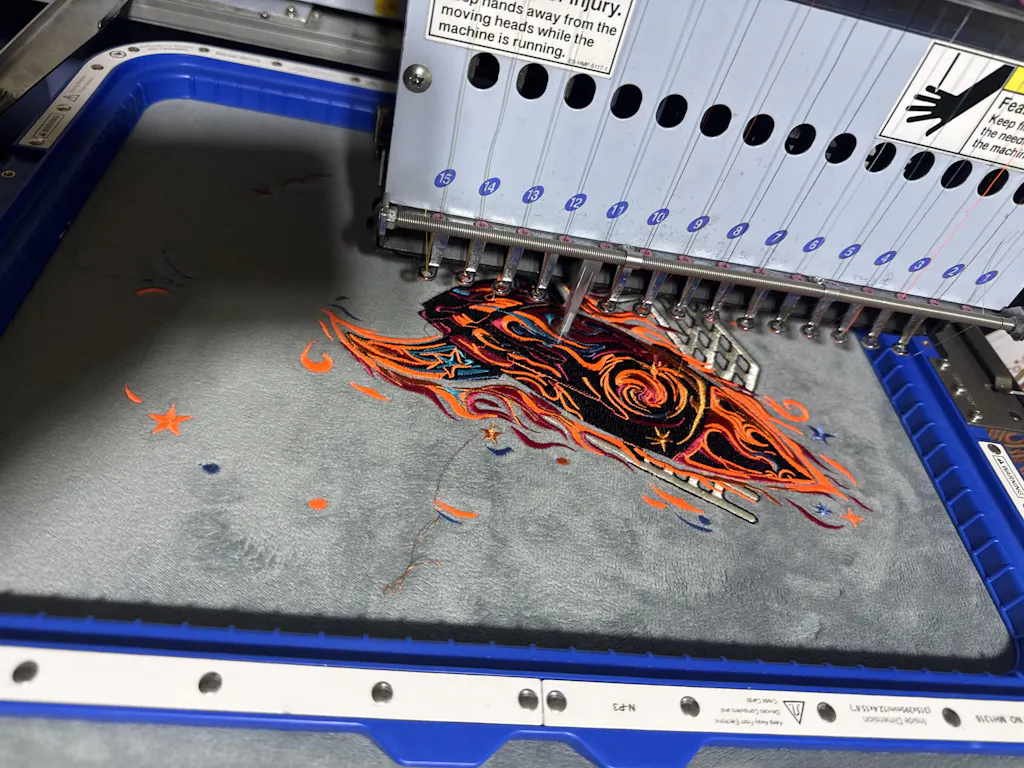
Even tension is the key to flawless letters. For garment embroidery, Sewtalent magnetic hoops are a game-changer in embroidery hoops and frames. Their strong, even grip holds fabric securely without leaving hoop marks (hoop burn), making them ideal for both beginners and professionals. The magnetic system adapts to various fabric thicknesses, ensuring your letters stay crisp and your fabric remains undamaged throughout the stitching process.
6.3 Needle Types and Curve-Handling Techniques
Needle Selection:
Match your needle size to your fabric and thread. Use finer needles for delicate fabrics and threads, and larger needles for thick materials or multiple strands.
Curve Navigation:
When stitching around tight curves, shorten your stitches for smoother lines. This is especially important for script fonts and intricate monograms—small, precise stitches help maintain the integrity of each letter’s shape.
Expert Tips:
- Use printed guides to practice your stitch path before starting on your final fabric.
- For complex or multi-part letters, plan your route to minimize thread shadows and avoid trailing threads across open spaces.
With the right materials and a few pro techniques, you’ll set yourself up for lettering success—one stitch, one letter, one masterpiece at a time.
7. Advanced Techniques for Professional Lettering Results
Ready to level up your embroidered lettering? This is where artistry meets precision—where every stitch, every curve, and every transition is thoughtfully planned for show-stopping results. Let’s dive into the advanced techniques that transform simple letters into typographic masterpieces.
7.1 Complex Stitch Combinations and Padding Methods
Professional letter embroidery is all about layering techniques for dimension and drama. One standout method is the padded satin stitch. Begin by padding the letter with a layer (or two) of split or chain stitches, following the shape of the letter. This foundation creates a raised surface. Next, cover the padding with tightly packed satin stitches, keeping your direction consistent for a glossy, sculpted finish. The result? Letters that leap off the fabric with bold, tactile presence.
But why stop there? Mixing stitches opens a whole new world of texture. For example, outline your letters with a stem stitch for that rope-like elegance, then fill the interior with split stitch for a subtle, braided effect. Or, pair buttonhole stitches with stem stitch outlines to create striking contrasts—each stitch type bringing its own personality to the letterform.
The real secret? Strategic combinations. Use herringbone with split stitch for refined, silk-threaded monograms, or alternate chain and back stitches for playful, chunky text. Advanced embroiderers plan these combinations based on the font’s style and the scale of the letters—flowing scripts get flowing stitches, while block letters can handle chunkier fills.
7.2 Thread Management for Intricate Designs
Ever notice how professional embroidery looks flawless from both front and back? That’s no accident—it’s the result of meticulous thread management.
Start by planning your path. Unlike handwriting, embroidery doesn’t always follow the same route. Map out a single-lane stitch path that avoids doubling back, which can cause unwanted bulk and visible thread “shadows.” For disconnected letters or those spaced far apart, always end your thread and start fresh to prevent show-through on light fabrics.
When moving from one part of a letter to another (say, the loop of a “b” to its stem), weave your thread under existing stitches on the fabric’s reverse side. This hides the transition and keeps the front pristine. For sharp corners, finish one stitch line and begin a new one with a backstitch approach—bring your needle up a stitch length away and go down at the corner for crisp, angular transitions.
Consistent tension is everything. Use shorter stitches on curves and corners for smooth lines, and adjust your strand count (four to six for bold letters, fewer for fine work) to match the letter’s weight and the fabric’s demands. The result? Clean, elegant letters—no lumps, bumps, or loose ends.
7.3 Tools for Precision in Large-Scale Projects
When your project scales up—think jackets, banners, or bulk garment runs—precision and efficiency become non-negotiable. This is where the right tools make all the difference.
Sewtalent magnetic hoops are a game-changer for garment embroidery. Their strong, even grip holds fabric taut without leaving marks. This creates an efficient hooping station for precision work., and the built-in alignment guides help you position your letters perfectly every time. No more fussing with screw-tightened frames or worrying about hoop burn—just smooth, stable stitching from start to finish.
Frame stability isn’t just about convenience; it’s the foundation for intricate stitch work. With a secure hoop, you can confidently execute complex combinations and padding techniques, knowing your fabric won’t slip or distort. Whether you’re creating a single showpiece or embroidering dozens of uniforms, Sewtalent hoops help you achieve professional, repeatable results—fast.
8. Conclusion: Your Path to Embroidered Lettering Excellence
Mastering embroidered lettering is a journey—one that starts with sourcing the perfect patterns, grows through hands-on practice with essential and advanced stitches, and flourishes with thoughtful choices in fonts and materials. As you experiment with new techniques and tools, you’ll discover your unique style and unlock endless possibilities for personalization. Embrace the process, keep learning, and let your creativity shine—one stitch, one letter, one masterpiece at a time.