1. Introduction to Embroidered Lettering
Personalized embroidery has become the heartbeat of modern crafting—think custom names on baby blankets, monogrammed shirts, or heartfelt messages stitched onto gifts. Name embroidery transforms ordinary fabric into something uniquely meaningful, and the secret to crisp, beautiful letters lies in your choice of stitches. The right technique doesn’t just spell out a name; it brings clarity, elegance, and a professional finish to every project.
In this guide, we’ll unravel the core stitches that give embroidered lettering its signature look—back stitch, stem stitch, and split stitch—along with essential tips for choosing threads and mastering curves. Whether you’re a seasoned embroiderer or just picking up your first needle, you’ll discover how the right stitch selection can elevate your lettering from “just okay” to truly show-stopping. Ready to add a personal touch that stands out? Let’s dive in.
Table of Contents
- 1. Introduction to Embroidered Lettering
- 2. Essential Stitches for Letter Embroidery
- 3. Optimizing Stitches for Different Letter Styles
- 4. Avoiding Common Mistakes in Letter Embroidery
- 5. Creative Fill Techniques for Bold Letters
- 6. Machine Embroidery Adaptation Strategies
- 7. Conclusion: Elevating Your Letter Embroidery
- 8. FAQ: Letter Embroidery Essentials
2. Essential Stitches for Letter Embroidery
Letter embroidery is all about precision—each stitch is a brushstroke in your textile masterpiece. Let’s break down the foundational stitches that consistently deliver clear, attractive results for names and initials.
2.1 Back Stitch: The Universal Outline Technique
Back stitch is the workhorse of letter embroidery. Its strength? Versatility. Whether you’re outlining crisp block letters or adding definition to bold fonts, back stitch creates a solid, unbroken line that stands the test of time.
Why Back Stitch Works:
- Clarity: Produces clean, defined edges—perfect for printed or sans-serif fonts.
- Durability: Holds up well on items that see frequent handling, like towels or shirts.
- Scalability: Adjusts easily to different letter sizes and thicknesses.
Thread Configuration:
- For delicate, thin letters: Use 1–2 strands of embroidery floss.
- For bold, chunky letters: Opt for 3–6 strands.
Curve Management:
- Shorten your stitches as you approach curves or corners—think of each stitch as a pixel shaping the arc. This prevents jagged lines and keeps your letters looking smooth.
Step-by-Step Tutorial:
- Bring your needle up at the starting point of your letter.
- Make your first stitch forward along the outline.
- Bring the needle up one stitch length ahead, then insert it back into the end of the previous stitch.
- Continue, always bringing the needle up ahead and going back into the previous stitch’s endpoint.
Pro Tip: For letters with varying width, outline the shape with back stitch, then fill thicker areas with additional rows, brick-style, for a bolder look.
2.2 Stem Stitch: Mastering Cursive Script
If you crave that elegant, flowing look—think wedding invitations or signature-style names—stem stitch is your go-to. This technique creates a rope-like, dimensional line that glides along curves with grace.
Why Stem Stitch Shines:
- Fluidity: Mimics the natural movement of handwriting, ideal for cursive and script fonts.
- Texture: Adds a subtle, rope-like twist for extra visual interest.
Curve Navigation:
- Shorten your stitches on tight bends to maintain smoothness.
- Always keep your working thread on the same side of the needle as you move along the line—this consistency is key to the signature twist.
Directional Consistency:
- Work in one direction throughout the letter (left to right for right-handers; reverse for lefties).
- For sharp corners, end your current line and restart with a back stitch to keep the angle crisp.
Beginner-Friendly Steps:
- Bring the needle up at your starting point.
- Insert the needle a short distance ahead along your line, then bring it up halfway back, keeping the working thread to one side.
- Repeat, always emerging through the previous stitch’s side, not the center.
Thread Choice: 2–3 strands offer the best balance of visibility and elegance for most scripts.
2.3 Split Stitch: Smooth Lines for Complex Curves
Split stitch is the unsung hero for ornate fonts and tricky curves. It creates a braided, slightly raised line that hugs every twist and turn.
Why Choose Split Stitch:
- Seamless Curves: Excels at navigating tight bends and intricate letter shapes.
- Texture: Offers a plaited look, blending each stitch for a soft, continuous line.
Corner Handling:
- The structure of split stitch makes it ideal for letters with sharp angles or complex forms—think "R" or "W."
Dual Purpose:
- Works as both an outline and a fill. For thick letters, use parallel rows of split stitch to fill in the space.
How-To:
- Bring the needle up at your starting point.
- Make a short stitch forward.
- Bring the needle up through the center of the previous stitch, literally splitting the floss.
- Continue, repeating the process along your letter’s outline.
Strand Recommendations:
- Use even numbers of strands (2, 4, or 6) for best results—this ensures an even split and a tidy finish.
Pro Tip: For extra-fine lines, a single strand can be split, as it’s made of two finer threads.
3. Optimizing Stitches for Different Letter Styles
Lettering isn’t one-size-fits-all. The stitch that makes a block letter pop may not flatter a flowing script. Let’s match stitches to fonts for the best results.
3.1 Font-Specific Stitch Pairings
Block & Sans-Serif Fonts:
- Best Stitch: Back stitch.
- Why: Delivers crisp, geometric edges and bold definition.
- Thread Thickness: 3–6 strands for large, bold letters; 1–2 for finer details.
Cursive & Script Fonts:
- Best Stitch: Stem stitch.
- Why: Its rope-like flow mirrors handwriting, keeping curves smooth and elegant.
- Thread Thickness: 2–3 strands maintain grace without bulk.
Combination Approaches:
- For fonts with both thick and thin strokes, outline with back or stem stitch, then fill bold areas with satin stitch or parallel rows of your outline stitch.
Quick Reference Table:
| Font Style | Outline Stitch | Fill Stitch | Thread Thickness |
|---|---|---|---|
| Block/Sans-Serif | Back Stitch | Satin/Chain | 3–6 strands embroidery hoop sizes |
| Cursive/Script | Stem Stitch | Split/Satin | 2–3 strands embroidery hoop sizes |
| Ornate/Complex | Split Stitch | Split/Satin | 1–4 strands embroidery hoop sizes |
3.2 Script Font Stitch Library
When it comes to script and handwritten fonts, the devil is in the curves. Here’s how the main stitches stack up:
Stem Stitch vs. Split Stitch:
| Feature | Stem Stitch | Split Stitch |
|---|---|---|
| Visual Texture | Rope-like, twisted | Braided, plaited |
| Curve Performance | Excellent on smooth curves | Superior on tight, complex curves |
| Fabric Bulk (Backside) | Moderate | Minimal—lies flatter |
| Best For | Flowing scripts, elegance | Intricate scripts, sharp corners |
| Strand Count | 2–3 for elegance | Even numbers (2/4/6) for best split |
Technical Tips:
- For tight script curves, shorten your stitch length—think “grain of rice” size or smaller.
- Keep outlines single-lane to avoid bulky overlaps.
- For scripts with thick and thin lines, pair stem stitch outlines with satin or split stitch fills.
Pro Insight: Split stitch produces less bulk on the fabric’s reverse, making it ideal for layered or overlapping scripts where a flat finish matters.
With these techniques and pairings, you’ll have the confidence to tackle any name or phrase—whether it’s a bold monogram or a delicate cursive signature. The right stitch, matched to your chosen font and thread, is the key to lettering that truly stands out.
4. Avoiding Common Mistakes in Letter Embroidery
Letter embroidery is a craft where the smallest misstep—be it a shadow of thread peeking through, a puckered curve, or a bulky corner—can turn crisp names into muddled messes. But don’t worry: mastering a few key prevention and troubleshooting strategies can keep your monograms and messages looking sharp, professional, and frustration-free.
4.1 Preventing Thread Shadows and Puckering
Ever finished a project only to discover ghostly lines of thread showing through your fabric, or unsightly puckers warping your beautiful script? You’re not alone. These issues plague even seasoned embroiderers, but a few foundational practices can save your stitches.
Stabilizer Selection:
The right stabilizer is your first defense. For lightweight or stretchy fabrics, a sturdier stabilizer—like a medium-weight cut-away—can dramatically reduce puckering and keep your letters crisp. Tear-away stabilizers work well for stable, woven fabrics and simpler letterforms. Always match your stabilizer to both the fabric and the complexity of your design.
Interfacing Layers:
Prevent thread shadows (where dark threads show through lighter fabric or subsequent stitches) by adding a thin layer of interfacing between your fabric and your design. This acts as a visual barrier, especially important when layering colors or correcting mistakes. Tear-away interfacing can be removed after stitching, leaving your work neat and clean.
Tension Control:
Proper thread tension is crucial. Too tight, and your fabric puckers; too loose, and your stitches look sloppy. Always test your tension on a scrap piece of your project fabric before diving in. Adjust both top and bobbin tensions incrementally, aiming for stitches that interlock smoothly without loops or pulls.
Hooping Techniques:
A properly tensioned embroidery hoop is the unsung hero of flawless lettering. Make sure your fabric is snug in the hoop—drum-tight but not stretched out of shape. For garments, hoop only the area to be embroidered, and avoid over-tightening, which can distort your letters once unhooped.
Thread Management:
Separate and reassemble your embroidery floss before stitching. This reduces twist tension, helps your stitches lie flat, and minimizes tangling—a small step that makes a big difference in stitch quality.
Pro Tips:
- End your thread after each letter (unless stitching small, adjacent letters or continuous scripts) to avoid trailing lines that can create visible shadows.
- For script fonts where letters connect, it’s acceptable to trail thread on the back, as the design naturally conceals it.
By focusing on these essentials—stabilizer, interfacing, tension, hooping, and thread prep—you’ll banish puckers and shadows, letting your lettering shine.
4.2 Advanced Techniques for Complex Letters (W, R)
Some letters are just...tricky. Think “W” with its sharp angles and multiple strokes, or “R” with that disconnected bowl and diagonal leg. These forms are notorious for causing thread shadows, registration headaches, and awkward stitch jumps. Here’s how to conquer them like a pro.
Strategic Path-Planning:
Before you stitch, plan your route. Unlike handwriting, embroidery requires a single-lane path—no doubling back over lines. For “W,” break the letter into its vertical and diagonal components, mapping out a sequence that minimizes overlapping stitches and jump threads. For “R,” treat the bowl and leg as separate modules, connecting them with hidden thread paths on the back.
Modular Stitching:
Tackle complex letters in segments. For example, stitch the left vertical stroke of “W,” tie off, then start the next segment. This modular approach keeps coverage consistent and prevents bulky build-up at intersections.
Jump Reduction:
Avoid long thread jumps between disconnected elements by weaving your thread under existing stitches on the back. This hides the thread and prevents shadows from showing through the fabric.
Stitch Sequencing:
Start with outlines using back stitch or split stitch for sharp corners, then fill in thicker areas with satin or chain stitch as needed. Adjust stitch length and density at corners—shorter, denser stitches maintain crisp angles without piling up excess thread.
Density Management:
Where strokes intersect (like the center of “W” or the bowl-leg junction in “R”), reduce stitch density slightly to avoid thread buildup and fabric distortion. This keeps your letters looking clean and professional.
Digitizing Principles for Machine Embroidery:
If you’re digitizing these letters for machine embroidery, use your software’s path-planning and sequencing tools. Map out entry and exit points, optimize underlay settings, and test your design with a stitch player before production.
Quality Control:
Test your letterforms on scrap fabric first. Watch for areas where stitches might cross too often or where tension issues arise. Adjust your plan accordingly—sometimes, removing and re-stitching a single segment is all it takes to achieve perfection.
By applying these advanced strategies, you’ll transform even the most complex letters into smooth, shadow-free showpieces—no more “problem child” initials in your embroidery projects.
5. Creative Fill Techniques for Bold Letters
Ready to make your letters leap off the fabric? When it comes to bold initials or monograms, creative fill techniques are your ticket to eye-catching, dimensional results. Whether you crave the silky sheen of satin stitch or the painterly magic of variegated thread gradients, these methods will elevate your lettering from basic to breathtaking.
5.1 Satin Stitch Filling Fundamentals
Satin stitch is the gold standard for filling thick letters—think classic monograms or statement initials. Its smooth, reflective surface creates a luxurious finish that’s both tactile and visually striking.
Step-by-Step Guide:
- Outline First: Begin by outlining the area to be filled with back stitch or split stitch. This creates a crisp border and prevents your fill stitches from wandering.
- Start in the Middle: For best coverage and control, start your satin stitches in the center of the shape and work outward. This “middle-start” technique helps maintain even stitch direction and prevents bunching at the edges.
- Directional Stitching: Lay each stitch directly beside the last, following the natural contour of the letter. Keep your stitches parallel and avoid overlapping or splitting them.
- Edge Definition: Use shorter stitches at curves and corners to maintain smooth, rounded edges. For wide sections, consider breaking up the fill with rows of long and short stitches to prevent sagging.
- Density Control: Adjust thread tension so stitches lie flat and snug against each other—but not so tight that they distort the fabric. For large letters, use more strands for fuller coverage; for small, intricate shapes, fewer strands allow for better detail.
Pro Tips:
- Always keep your fabric taut in the hoop to achieve a flawless satin finish.
- Experiment with different thread counts and directions to create subtle shading or highlights within your letters.
With practice, your satin stitch fills will look as smooth as silk—perfect for making any name or initial the star of your project.
5.2 Variegated Thread Gradients
Why settle for a single color when you can infuse your letters with a stunning ombre or rainbow effect? brothreads variegated threads—those magical skeins that shift seamlessly from one hue to another—bring instant artistry to bold lettering.
Techniques for Ombre Effects:
- Pre-Planning Color Placement: Before you start, test your variegated thread on a scrap to see where color changes occur. For best results, align your stitching so the gradient flows naturally along the shape of each letter.
- Blending Methods: For large initials, use long and short satin stitches to blend color transitions smoothly. Stitch over the area multiple times with different sections of the thread to build up depth and texture.
- Layering: Combine variegated threads with solid colors for richer, more complex effects. Layering stitches in slightly overlapping rows can mimic watercolor blends or dramatic color shifts.
- Direction Matters: Always stitch in the same direction to keep color transitions consistent. If using multiple strands, align the colors for a bolder gradient, or mix them for a more subtle, blended look.
Pro Tips:
- The gradient effect is most visible on large letters; for smaller text, choose threads with subtle, closely related color changes.
- Mark sections where you want color changes to occur and plan your thread usage accordingly.
With variegated threads, every letter becomes a canvas—let your creativity run wild and watch your embroidery transform into a vibrant work of art.
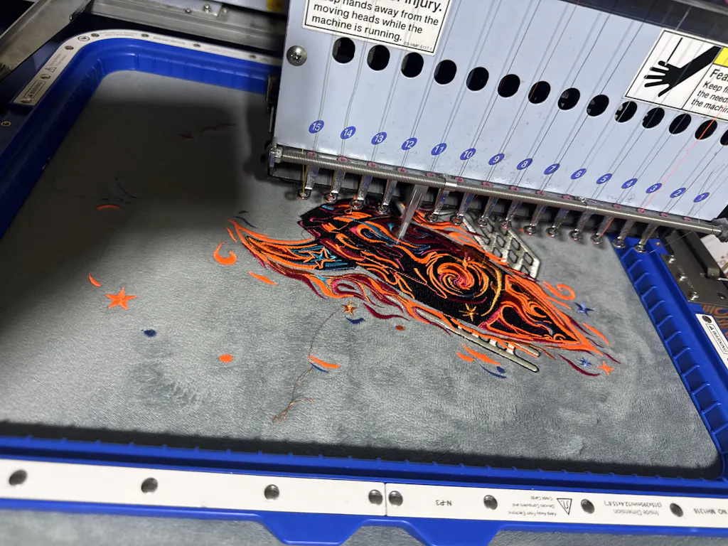
6. Machine Embroidery Adaptation Strategies
Hand-stitched letters have undeniable charm, but sometimes you need the speed and precision of machine embroidery—especially for large projects or repeat orders. Adapting hand embroidery techniques for the machine isn’t just about pressing “start.” It’s about smart digitizing, stitch selection, and (for garments) choosing the right hooping solution.
6.1 Digitizing Hand Stitches for Machines
Translating the elegance of hand-stitched letters into machine embroidery starts with expert digitizing. Here’s how to bridge the gap:
Design Preparation: Import your artwork into embroidery machine digitizing software (like Wilcom, Brother, or Janome). Clean up your font, simplify complex curves, and ensure all elements are clear and legible at your intended size.
Stitch Path Planning: Map out the sequence of underlays and top stitches. For letter outlines, use satin stitches for crisp, smooth borders—ideal for sans-serif and modern fonts. For filled areas, opt for fill stitches, adjusting angle and density for optimal coverage.
Stitch Length Adjustments: Set satin stitch lengths according to fabric and letter size; too long, and stitches may snag or loop; too short, and the design can look choppy. For most name embroidery, density settings between 0.4mm and 0.8mm are typical, but always test on scrap fabric.
Underlay Configuration: Choose the right underlay (center run, edge run, or zigzag) based on fabric stability and letter complexity. Proper underlays prevent shifting and puckering, especially on stretchy or delicate fabrics.
Pull Compensation: Account for fabric movement and thread tension by adjusting pull compensation in your software. This ensures your finished letters match your design dimensions, not shrinking or distorting during stitching.
Test Stitch-Outs: Always run a test on similar fabric before full production. Evaluate registration, density, and color transitions, then refine your settings as needed.
By mastering these digitizing fundamentals, you’ll achieve machine-stitched names that rival the beauty and clarity of hand embroidery—at a fraction of the time.
6.2 Hooping Solutions for Garment Precision
When it comes to machine-embroidered names on garments, precision is everything. Uneven tension or shifting fabric can turn a perfect design into a production nightmare. That’s where magnetic embroidery hoops like Sewtalent come into play.
Why Magnetic Hoops Matter: Traditional hoops often struggle with thicker or stretchy fabrics, leading to hoop burn, slippage, or endless readjustments. Magnetic hoops, such as those from Sewtalent, offer a game-changing solution for garment embroidery (note: not for caps/hats):
- Superior Fabric Grip: High-strength magnets automatically adapt to different fabric thicknesses, holding everything from delicate cotton to heavy denim securely in place.
- Time Savings: Magnetic hoops dramatically speed up the hooping process—just position, snap, and you’re ready to stitch. No more fiddling with screws or risking misalignment.
- Reduced Hoop Burn: Evenly distributed magnetic pressure means less risk of leaving marks or damaging finished garments.
- Consistent Results: Uniform tension ensures every letter is crisp, every outline sharp, and every fill smooth—batch after batch.
Whether you’re personalizing a single shirt or running a production line, investing in a quality magnetic hoop like Sewtalent can transform your workflow—making garment name embroidery faster, easier, and more professional.
Ready to conquer every letter, every fabric, every project? With these advanced strategies and creative tools, you’ll turn every name into a stitched work of art—by hand or by machine.
7. Conclusion: Elevating Your Letter Embroidery
Mastering name embroidery stitches is less about memorizing every technique and more about developing an eye for detail, a steady hand, and the confidence to experiment. Throughout this guide, you’ve discovered how stitch selection—whether it’s the crisp definition of back stitch, the flowing elegance of stem stitch, or the braided texture of split stitch—transforms simple letters into personal works of art. We’ve explored how pairing stitches to font styles, managing thread and fabric, and even adapting hand techniques for machine embroidery can make all the difference in clarity and style.
The real magic happens when you put these tips into practice. Try outlining bold block letters with back stitch, filling chunky initials with satin stitch, or blending colors with variegated threads for a unique ombre effect. Don’t shy away from troubleshooting—uneven curves and tricky corners are simply invitations to refine your technique. Every project is a chance to learn, grow, and express yourself.
So, pick up your needle, choose your favorite thread, and let your creativity lead the way. With each name you stitch, you’re not just embroidering letters—you’re telling a story, one beautiful detail at a time.
8. FAQ: Letter Embroidery Essentials
8.1 Q: What is the best stitch for small script or delicate lettering?
A: For small script or fine letters, back stitch and split stitch are top choices. Both offer excellent control and clarity with minimal bulk—just be sure to use 1–2 strands of floss and keep your stitches short for smooth curves and sharp details.
8.2 Q: How can I fix uneven curves or bumpy lines in my embroidered letters?
A: The secret is to shorten your stitches as you approach curves or corners. Smaller stitches allow you to follow the letter’s path more accurately, preventing angular or jagged lines. If you notice bumps, carefully remove the problematic stitches and restitch with a lighter touch and closer spacing.
8.3 Q: What thread should I use for lettering, and how many strands are ideal?
A: Standard six-strand embroidery floss is versatile and widely used. For thin or small letters, use 1–2 strands; for bolder or larger letters, 3–6 strands work well. Always match your thread thickness to the size and style of your font for best results.
8.4 Q: How do I prevent thread shadows from showing through my fabric?
A: Avoid trailing thread between letters on the back of your work, especially on light fabrics. Instead, end your thread after each letter or weave it under existing stitches to hide it. Using a thin layer of interfacing can also help prevent shadows.
8.5 Q: What’s the best way to fill thick or bold letters?
A: Satin stitch is a classic choice for filling bold letters, creating a smooth, glossy finish. For added texture or color effects, try chain stitch, split stitch in rows, or experiment with variegated threads for gradients.
8.6 Q: Can I combine different stitches in the same word or letter?
A: Absolutely! Mixing outline stitches (like back or stem stitch) with fill stitches (such as satin or chain stitch) can add dimension and interest to your lettering. Don’t hesitate to experiment—sometimes the most striking results come from creative combinations.
8.7 Q: How do I choose the right font for hand embroidery?
A: Consider the size and purpose of your project. Simple, sans-serif fonts are easier for small or detailed work, while script or decorative fonts shine in larger, statement pieces. Always test a few letters before committing to a full design.
Ready to stitch your story? With these answers and the techniques you’ve learned, you’re set to create lettering that’s as unique and expressive as your imagination. Happy stitching!