1. Introduction: The Critical Role of Font Choice in Machine Embroidery
Font selection in machine embroidery is more than a design choice—it determines clarity, durability, and a polished finish. The right typeface will read cleanly at size, suit the fabric’s texture, and keep stitching stable across tees, hoodies, hats, and bags.
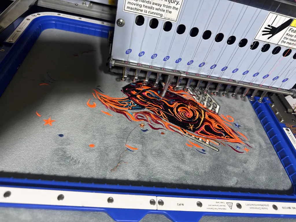
Consistent hooping with a reliable magnetic embroidery hoop also supports even tension, which helps text stay crisp.
| Fabric Type | Stabilizer Choice | Why It Works |
|---|---|---|
| Knits | Cut-away + adhesive spray | Prevents stretch distortion |
| Silk | Water-soluble film | Dissolves without residue |
| Leather | Tear-away + masking fabric | Cushions without sticking |
Table of Contents
- 1. Introduction: The Critical Role of Font Choice in Machine Embroidery
- 2. Top Recommended Embroidery Fonts for Clean, Professional Results
- 3. Ideal Font Characteristics: Simplicity, Spacing, and Stitchability
- 4. Product-Specific Font Selection: T-Shirts, Hoodies, Hats, and Bags
- 5. Advanced Techniques: Digitizing and Optimizing Fonts
- 6. Troubleshooting Common Font Stitching Issues
- 7. Where to Find Reliable Embroidery Fonts
- 8. Conclusion: Key Takeaways for Perfect Embroidery Text
- 9. FAQ: Embroidery Font Essentials
2. Top Recommended Embroidery Fonts for Clean, Professional Results
Picking fonts for embroidery is about precision. The best families deliver readability, consistent stitch paths, and versatility from small monograms to bold logos.
2.1 Sans-Serif Fonts: Clarity and Versatility
Sans-serif fonts are the workhorses of legible embroidery. Their clean strokes and even spacing remain readable at small sizes and from a distance.
- Arial: Straightforward, beginner-friendly stitching for names, logos, and casual wear.
- Helvetica: Balanced and elegant, stays clear even on small patches.
- Century Gothic: Smooth curves for modern designs on cotton or satin.
- Montserrat: Geometric, crisp, and highly professional.
- Proxima Nova: Stable across sizes and weights; versatile in many projects.
- Futura: Evenly weighted and minimalist.
Why they win: Block/sans-serif fonts can scale down to roughly five millimeters (caps) and still be legible when digitized with satin stitches. Learning block fonts first builds dependable results.
Beginner tip: Arial and Century Gothic minimize errors and help you gain confidence early on.
2.2 Serif and Script Fonts: When Elegance Meets Practicality
Serif and script fonts add sophistication but demand careful setup.
Serif options: - Times New Roman & Georgia: Formal and clear on smooth fabrics; not ideal on fleece. - Copperplate & Garamond: Strong statement at medium/larger sizes. - Courier: Even spacing and reliable readability.
Script options: - Dancing Script: Flowing curves; best large on smooth fabrics. - Pacifico: Friendly, handwritten feel for accessories or relaxed apparel. - Copperplate Gothic Bold: Vintage authority with bold strokes.
Key considerations: - Size: Scripts need space; avoid tiny script lettering. - Fabric: Intricate details get lost on textured or high-pile materials. - Digitizing: Plan underlay/overlays carefully to prevent gaps and breaks.
Pro tip: Test on the actual fabric before committing, especially with scripts.
3. Ideal Font Characteristics: Simplicity, Spacing, and Stitchability
The best embroidery fonts share clear strokes, balanced spacing, and realistic minimum sizes.
3.1 Design Principles for Flawless Stitching
- Keep it simple: Avoid ultra-thin or overly thick strokes; aim for balanced coverage.
- Limit detail: Small flourishes often become illegible.
- Respect size thresholds: Under ~0.25 inches tall is risky.
- Balance spacing: Wider spacing helps on textured or stretchy materials.
| Text Size | Recommended Font Type | Rationale |
|---|---|---|
| Small | Sans-serif (Arial, Helvetica) | Simplicity aids clarity |
| Medium | Serif (Times New Roman) | Classic readability |
| Large | Decorative (Script, Custom) | Visibility allows creativity |
Fabric compatibility highlights: - Thick/Textured: Bold block fonts (e.g., Impact) avoid sinking. - Stretchy: Simple sans serif (e.g., Futura) reduces distortion. - Smooth: Serif or script maintains detail. - High Pile: Thick-stroke fonts stay visible.
| Fabric Type | Recommended Fonts | Key Considerations |
|---|---|---|
| Thick/Textured | Bold sans-serif, block fonts (Impact) | Avoid thin strokes; use stabilizers |
| Stretchy | Simple sans-serif (Futura) | Prevent distortion with minimal detail |
| Smooth | Script (Great Vibes), serif (Georgia) | Fine details remain visible |
| High Pile | Thick-stroke fonts | Ensure stitches rise above fabric |
Stable hooping—especially with magnetic hoops for embroidery machines—helps maintain spacing and reduces shifting on knits and fleece.
3.2 Fonts to Avoid: Pitfalls and Alternatives
Troublemakers include thin scripts, detailed serifs with delicate lines, and overly intricate styles—each invites gaps, breakage, or illegible merging.
Common failures: - Gaps in letters - Thread breaks - Letters merging - Distortion on high-pile or stretchy fabrics
Safer swaps: - Instead of Brush Script, try Proxima Nova for modern stability. - On towels, replace ornate serifs with bold block options like Impact or Rockwell.
Google-result caution: Connected scripts can tangle and blur; structured, bold fonts keep letters distinct.
Final thought: Bold, simple, and well-spaced fonts win across most materials.
4. Product-Specific Font Selection: T-Shirts, Hoodies, Hats, and Bags
Different fabrics and shapes reward particular font traits. Match the typeface to the surface for crisp, readable text.
4.1 Smooth vs. Textured Fabrics: Font Pairing Guide
Smooth fabrics (cotton, linen, satin): Accommodate scripts, classic serifs, and thin decorative fonts. Georgia and Copperplate provide a formal touch on upscale tees and robes; scripts shine when sized generously.
Textured fabrics (fleece, terry cloth, knits): Bold block and sans-serif fonts—Arial, Helvetica, Rockwell, Impact—stand up to nap and loops. Avoid delicate scripts that disappear into texture.
For thick or textured materials, stabilizing is essential. This is where the sewtalent magnetic hoops approach excels by holding bulky layers securely so letters stay sharp and fabric remains flat.
| Fabric Type | Recommended Fonts | Avoid |
|---|---|---|
| Smooth (Tees) | Script, Serif, Thin Decorative | Bold block fonts |
| Textured (Hoodies) | Bold Sans-Serif, Geometric | Script, Thin fonts |
| Plush/Fuzzy | Thick-lined, Minimal Detail | Intricate, Delicate fonts |
Best practice: Test font and size on scrap from the actual material before production.
4.2 Hat and Bag Embroidery: Curved Surface Solutions
Hats (caps, beanies): Curved surfaces demand simple block fonts like Helvetica or Franklin Gothic Heavy. Avoid ornate scripts that warp.
Bags (totes, backpacks): Durable materials favor bold sans-serif and geometric picks (Gotham, Rockwell). Copperplate can deliver a classic look on totes.
A snug fit from magnetic embroidery hoops reduces slippage on curved or uneven items and helps keep designs centered.
Securing the fabric: Even, powerful clamping keeps hats and bags steady, reducing puckering and off-center results.
5. Advanced Techniques: Digitizing and Optimizing Fonts
Superior text results come from smart digitizing—density, underlay, and stitch type all matter.
5.1 Density and Underlay Strategies for Crisp Text
Stitch types: - Satin stitches: Ideal for small fonts (up to ~4 mm height) with smooth coverage. - Running stitches: Useful for tiny outlines; less durable overall.
Density: - Small fonts: Increase density to prevent show-through; avoid puckering. - Large fonts: Lower density is fine; consider fill stitches.
Underlay strategies: - Center run: General stabilization. - Edge walk: Smooths satin edges; lighten on delicate fabrics. - Zigzag: Reinforces stretchy knits; increase density when needed. - Tatami: Use sparingly on thick materials (e.g., leather) to prevent stiffness.
| Underlay Type | Best Use | Adjustment Tips |
|---|---|---|
| Center Run | General stabilization | Default for most fabrics |
| Edge Walk | Satin stitch edges | Lower density for lightweight fabric |
| Zigzag | Stretchy/knit fabrics | Boost density for grip |
| Tatami | Thick materials (leather) | Use less to prevent stiffness |
YouTube-proven tips: Use overlays to close gaps, slow machine speed (30–50%) for small, intricate fonts, pick high-contrast polyester threads, and match thread weight (e.g., 60wt for small letters).
Always test on target fabric before running production.
5.2 Software Tools for Font Customization
Popular platforms: Hatch, Embrilliance, Chroma (Ricoma), Embird, and Ink/Stitch support importing, editing, and custom digitizing.
Customization techniques: - Scale larger, then down to target for stability. - Manually edit stitch paths on complex fonts. - Fine-tune density and underlay per letter or section.
Use software previews and sample stitch-outs to catch issues early. Save presets for favorite fonts and maintain a chart of styles and thread colors to speed future jobs.
6. Troubleshooting Common Font Stitching Issues
Even pros run into thread breaks, gaps, or distortion. Methodical fixes restore clean results.
6.1 Solving Thread Breaks and Gaps
Thread breaks: - Adjust top/bobbin tension; satin should reveal 1/3–1/2 bobbin on the back. - Use sharp needles (75/11 standard; 90/14 heavy) and quality thread (60wt for small letters). - Slow machine speed for small fonts; avoid over-dense points; add tie-in/tie-off; clean lint regularly.
Gaps in letters: - Add underlay; choose correct stabilizer (cutaway for stretch). - Increase density on thick fabrics. - For minor outline gaps, a fine-tip marker can camouflage fabric peeks.
6.2 High-Pile Fabric Challenges: Stabilization Solutions
On towels, fleece, and plush items, letters can sink or shift. Use sturdy cutaway stabilizer (multiple layers for extra thickness), raise density, select a 90/14 needle, and ensure a smooth thread path.
Rigid support from magnetic embroidery frames helps keep thick textiles flat and prevents mid-stitch movement.
Pro tip: The Sewtalent magnetic embroidery hoop holds high-pile materials reliably so text stays visible and crisp.
7. Where to Find Reliable Embroidery Fonts
High-quality, stitch-ready fonts come from dedicated software platforms and curated marketplaces.
Trusted Software Platforms
| Platform | Key Features | Pricing |
|---|---|---|
| Hatch Embroidery | Pro-grade digitizing, CorelDRAW integration, 400+ free designs | $1,799 (Mega Pack) |
| Embrilliance | BX font system, modular pricing, Mac/PC compatible | $139 (Essentials) |
| Chroma (Ricoma) | Tiered plans, auto-digitizing, scalable features | Subscription-based |
| Embird | Manual digitizing, TrueType/OTF support, 70+ file formats | One-time purchase |
| Ink/Stitch | Open-source, Inkscape extension, customizable | Free |
Marketplaces and Font Shops
- Etsy & Urban Threads: User-created fonts by the piece or bundle.
- Embroidery Library & Creative Fabrica: Subscription models for curated libraries.
- Schuler Studio: Elaborate monograms and refined digitizing.
Tip: Follow favorite digitizers to catch sales and expand your library affordably.
Understanding Font Types and Compatibility
| Font Type | Description | Software Compatibility |
|---|---|---|
| BX | Optimized for the Embrilliance ecosystem | Embrilliance |
| TrueType (TTF) | Computer fonts; need conversion for embroidery | Embird, Hatch, Chroma |
| ESA | Platform-specific embroidery fonts | Limited to niche software |
Community, Cataloging, and Workflow
Keep digital and printed charts of font names, monogram styles, and thread colors. Sample new fonts, prune the weak ones, and save settings for repeatable results.
Recommendations: - Beginners: Embrilliance Essentials for easy BX management. - Professionals: Hatch Digitizer for commercial libraries. - Budget-conscious: Ink/Stitch or Embird. - Variety seekers: Explore Etsy or subscription libraries.
8. Conclusion: Key Takeaways for Perfect Embroidery Text
Prioritize simplicity and legibility, match fonts to fabric, and test before production. Dial in density and underlay, and keep an organized font chart to streamline work. Before you stitch, verify hooping with an embroidery frame that holds thick or curved items steady. With access to embroidery designs online and these strategies, your text will stitch as sharp as it looks on screen.
9. FAQ: Embroidery Font Essentials
9.1 Q: What’s the best font for embroidery beginners?
A: Arial. Its clean sans-serif design is easy to digitize and stitch across many fabrics.
9.2 Q: Can I embroider small script fonts?
A: Generally no. Thin, connected strokes lose clarity at small sizes. Use block/sans-serif for tiny text.
9.3 Q: How do I fix puckered letters in embroidery?
A: Adjust density and stabilizer choice. Over-dense stitching or weak stabilization causes puckering. Test on scrap first.
9.4 Q: Where can I find high-quality embroidery fonts?
A: Software ecosystems (Embrilliance, Hatch), marketplaces (Etsy, Creative Fabrica), and specialty digitizers (Schuler Studio). Always sample before big projects.
9.5 Q: What file format should I use for my embroidery machine?
A: Use the format your machine requires (e.g., .PES, .DST). Most sellers provide multiple formats.
9.6 Q: How can I organize my embroidery font library?
A: Maintain digital/printed charts of fonts, monogram styles, and thread colors to speed selection and approvals.