1. Introduction to Hand Embroidering Names
Hand embroidering names blends craft and expression, turning quilts, denim, and linens into keepsakes. This guide focuses on readable, beautiful lettering: choosing the right stitches (backstitch, stem stitch, split stitch), pairing floss and fabrics, preventing puckering and thread shadows, and planning fonts and placement. You’ll also find practical tools, stabilizers, and hoop advice—plus beginner-friendly practice ideas—to help you personalize projects one letter at a time.
Table of Contents
- 1. Introduction to Hand Embroidering Names
- 2. Essential Hand Embroidery Stitches for Lettering
- 3. Selecting Materials and Tools for Name Embroidery
- 4. Solving Common Name Embroidery Challenges
- 5. Personalizing Projects with Embroidered Names
- 6. Comparing Stitch Textures for Lettering Effects
- 7. Beginner Resources and Practice Techniques
- 8. Conclusion: Mastering the Art of Name Embroidery
- 9. Frequently Asked Questions
2. Essential Hand Embroidery Stitches for Lettering
When you letter by hand, your stitch choice defines legibility and mood. These three stitches form the core: backstitch for crisp lines, stem stitch for flowing curves, and split stitch for compact texture.
2.1 Backstitch: Crisp Outlines for Block Letters
Backstitch creates clean, linear outlines—great for block fonts and bold text.
How-To:
- Thread prep: 1–2 strands for delicate lines; 3–4 strands for bolder outlines.
- Start: Come up at the letter start, down at the end of the first segment.
- Stitching: Come up just behind the previous stitch, then down at the next end point to build a continuous line.
- Corners/curves: Shorten stitch length around tight bends for smooth edges (Wandering Threads Embroidery).
Pro Tips:
- Outline or fill block letters; stack rows for extra dimension.
- Plan your path to avoid doubling back over the same line (Wandering Threads Embroidery, Instructables).
Visual: Think of tracing a name with tiny, precise dashes.
2.2 Stem Stitch: Elegant Curves for Script Fonts
Stem stitch gives rope-like, slightly twisted lines—ideal for cursive and script.
How-To:
- Thread prep: 2–3 strands for a medium-weight line.
- Start: Begin at the base of the letter.
- Stitching: Down at the end of the first segment, then up to the right of the previous stitch to form a loop; keep the loop on the outside of the curve (Wandering Threads Embroidery, YouTube).
- Curves: Shorten stitches and rotate your hoop to maintain direction.
Pro Tips:
- Shine in continuous lines (cursive names, flowing monograms).
- Travel under existing stitches on the back to hide thread paths (Perplexity Q&A, YouTube).
Analogy: It’s the calligraphy pen of embroidery—made for flourishes.
2.3 Split Stitch: Textured Details for Small Letters
Split stitch delivers a plaited texture that excels on small letters and intricate curves.
How-To:
- Thread prep: 1–2 strands for fine detail.
- Start: Bring the needle up at the top of the letter.
- Stitching: Down at the end of the segment, up through the center of the previous stitch to split the floss.
- Curves: Keep stitch length consistent and adjust needle angle (Perplexity Q&A, Beginner’s Guide).
Pro Tips:
- Works best with an even number of strands; take your time splitting each stitch.
- Adjust strand count to control texture density.
Story: Picture a tiny braid tracking the outline of each letter.
| Stitch | Texture | Best For | Difficulty |
|---|---|---|---|
| Backstitch | Clean, linear | Outlines, block letters | Easy |
| Stem Stitch | Twisted, rope-like | Cursive, flowing curves | Moderate |
| Split Stitch | Plaited, delicate | Small letters, detail | Moderate |
Quick Tips for All Stitches:
- Shorten stitch length for curves.
- Plan your path to avoid thread shadows.
- Layer or combine stitches for thick letter sections.
3. Selecting Materials and Tools for Name Embroidery
Solid materials and tools make lettering easier. Choose floss, fabric, stabilizer, hoop, and needle to match your design and fabric behavior.
3.1 Embroidery Floss and Fabric Pairings
Floss Choices:
- Stranded Cotton Floss: Classic six-strand (e.g., DMC). Use 1–2 strands for lightweight knits (t‑shirts) or 3 strands for quilts (Perplexity Q&A, YouTube).
- Silk Floss: Lustrous and luxurious; more delicate and slippery—save for special details (YouTube "Using Handspun Yarn for Embroidery?").
- Pearl Cotton: Single-strand, non-divisible; beginner-friendly and less tangle-prone (Made By Marzipan).
Fabric Guidance:
- T‑Shirts/Knits: 1–2 strands; pair with adhesive stabilizer to prevent stretching (Wandering Threads Embroidery, Perplexity Q&A).
- Denim: Works well with regular floss; use a larger needle (Wandering Threads Embroidery).
- Quilts: 3 strands balance visibility and neatness; iron-on or tear-away stabilizer recommended.
- Delicate Fabrics: 1 strand with lightweight stabilizer for a refined look.
Pro Tip: Fewer strands = finer, lace-like lines; more strands = chunkier, bolder letters (YouTube "A Quick Guide to Knowing How Many Strands of Embroidery Floss to Use in Projects").
3.2 Stabilizers and Hoops: Preventing Distortion
Stabilizers:
- Adhesive (Stick-and-Tear): Great for stretchy fabrics (t‑shirts, denim). Preserves weave and removes easily.
- Iron-On: Best for non-stretch fabrics and appliqué; minimal residue.
- Tear-Away: Common in machine embroidery; budget-friendly but harsher on delicate fabrics.
| Stabilizer Type | Use Case | Pros/Cons |
|---|---|---|
| Adhesive (Stick-and-Tear) | Stretchy fabrics (t‑shirts, denim) | Easy removal, preserves weave |
| Iron-On | Non-stretch/appliqué | Lightweight, minimal residue |
| Tear-Away | Machine embroidery | Cost-effective, less gentle |
Hoops:
-
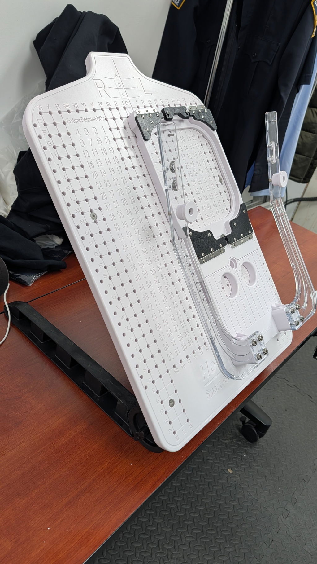
Size matters: For names on garments or denim, a 4–6" hoop is big enough to keep fabric taut yet small enough to avoid distortion. For garments, many crafters rely on magnetic embroidery hoops to keep layers flat (Perplexity Q&A, Instructables).
-
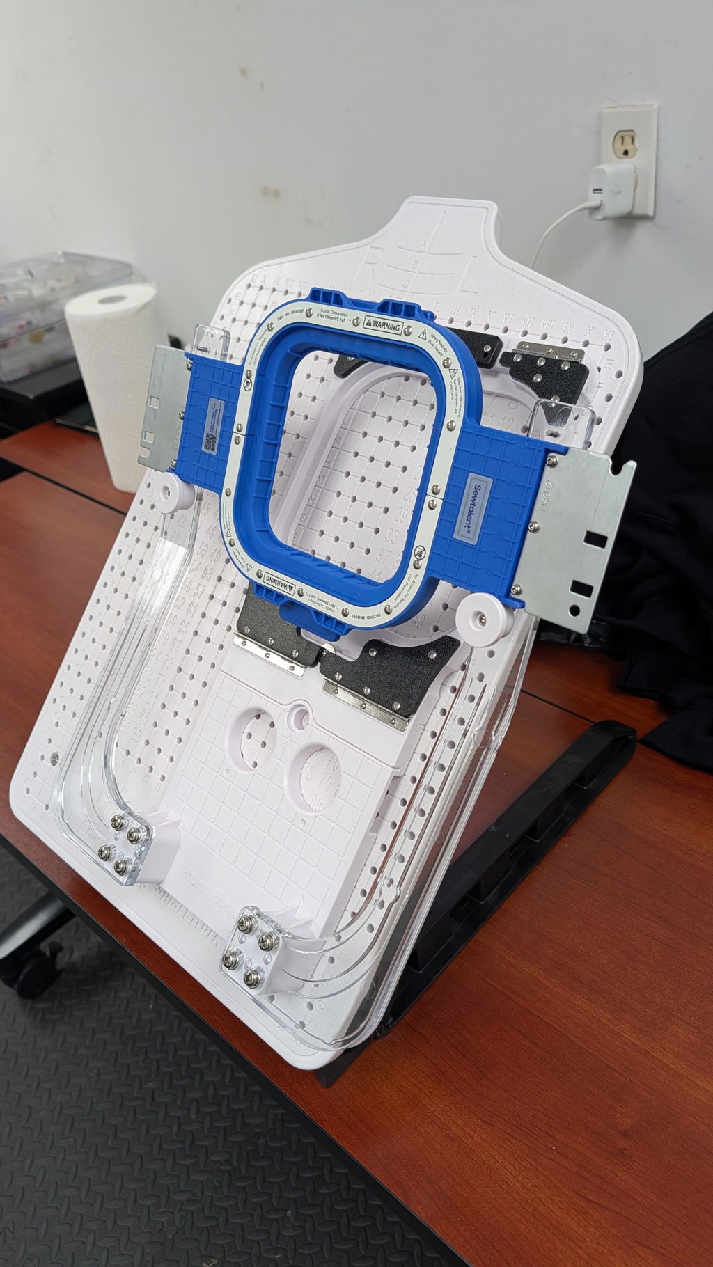
Sewtalent Magnetic Hoops: For garment embroidery, Sewtalent’s magnetic hoop provides even tension, prevents distortion, and saves time. Its powerful magnets adapt to varying fabric thicknesses for quick setup—especially helpful on repeat projects. Note: designed for garments, not caps/hats. (Sewtalent Brand Introduction)
Why Hoops Matter: A well-chosen hoop keeps your fabric drum-tight for precise stitches and reduced puckering—a must for neat lettering. Sturdy magnetic embroidery frames help maintain consistent tension.
3.3 Needles and Transfer Methods
Needle Selection:
- Crewel/Embroidery Needles: Sharp, long eye (sizes 1–12). Ideal for cotton floss and standard fabrics (Perplexity Q&A, Instructables).
- Tapestry Needles: Blunt; useful for thick fabrics like denim or for cross-stitch.
Transfer Techniques:
- Heat-Transfer Pens: Trace and iron on printed fonts or custom designs (Instructables).
- Water-Erasable/Disappearing Ink Pens: Mark directly; lines vanish with water or time (Wandering Threads Embroidery).
- Light Table/Window: Trace printed designs through fabric for accurate placement.
Pro Tip: Test your transfer method on scrap to ensure removability.
4. Solving Common Name Embroidery Challenges
Smooth, professional names require taming thread shadows, puckering, and uneven curves. Use the right stabilizer, tension, hooping, and stitch length to keep letters clean and legible.
4.1 Eliminating Thread Shadows and Puckering
Thread Shadows: Trails or knots show through on light or thin fabrics due to excess tension, heavy threads, or traveling between letters.
Fixes:
- Adjust Thread Tension: Use the "I-test"—slight resistance, no snapping.
- Choose Lighter Threads: On delicate fabrics, try lighter thread (60–75 weight or ≤200 dtex). Polyester or rayon minimize show-through and breakage.
- Mind Your Path: End after each letter (unless cursive or tightly spaced). If you must travel, weave under existing stitches on the back.
Fabric Puckering: Caused by over-tension, poor stabilizer choice, or improper hooping.
Fixes:
- Pick the Proper Stabilizer: tear-away for stable cottons; cut-away for knits; wash-away for sheer or lace.
- Hooping Technique: Secure firmly over stabilizer without stretching; avoid floating.
- Thread Tension: Aim for a balanced bobbin-to-top ratio (1:3 is a helpful guideline).
- Underlay Stitches: Add a stabilizing foundation before main stitches.
Switching to magnetic hoops for embroidery machines that clamp evenly can also reduce puckering on layered garments.
Sewtalent Magnetic Hoops: For garment work, these hoops clamp fabric evenly across varying thicknesses, preventing overstretching and saving setup time. If traditional hoops feel fussy, even tension and quick setup can be a game-changer.
Prefer tradition? Well-sized machine embroidery hoops still help keep layers flat when paired with the right stabilizer and tension.
| Challenge | Primary Cause | Solution |
|---|---|---|
| Thread Shadows | High tension, heavy threads | Adjust tension, lighter thread, hide tails |
| Fabric Puckering | Over-tension, poor hooping | Proper stabilizer, even hooping, tension tweaks |
| Uneven Curves | Large stitches, dull needles | Shorten stitches, finer needle |
Pro Tip: Test on scrap first; replace needles every 1–2 projects to avoid snags.
4.2 Perfecting Curves and Consistent Stitches
- Shorten stitches on tight bends for smoother curves.
- Plan a path that avoids doubling back; break letters into logical segments.
- Mimic your handwriting flow—if the pen overlaps, the stitches should too.
- Keep stitch length consistent; go shorter only on curves.
Made By Marzipan Strategy: For quilt labels or thick fabrics, add iron-on interfacing first. Print your font, pin/iron in place, and use backstitch for control. Tear away paper carefully after stitching.
| Issue | Solution |
|---|---|
| Jagged Curves | Shorten stitches, plan path, fine needle |
| Inconsistent Stitches | Practice on scrap, steady tension |
| Overlapping Lines | Map your route before starting |
5. Personalizing Projects with Embroidered Names
Lettering choices shape the vibe—classic, modern, or playful—and placement frames the design on napkins, quilts, and clothing.
5.1 Font Selection and Placement Strategies
Font Choices:
- Serif: Classic for monograms and heirloom quilts.
- Sans-Serif: Clean, modern for clothing and casual linens.
- Script: Flowing, handwritten feel for quotes and names.
Placement Tips:
- Napkins: Center monograms or names; a circular border adds polish.
- Quilts: Names or dedications in corner blocks or integrated into the pattern.
- Clothing: Chest, sleeve, or hem for subtle placement; bold initials on jackets for flair.
| Item | Placement Strategy | Example |
|---|---|---|
| Napkins | Centered monogram or name | "J.S." in a circular border |
| Quilts | Corner blocks or pattern integration | Family name in a quilt square |
| Clothing | Chest, sleeve, or hem | Bold initials on a jacket |
Pro Tip: Test fonts and placement on scrap; some print-perfect fonts are tricky to stitch.
5.2 Inspiring Projects: From T-Shirts to Quilts
Looking for ideas? A compact embroidery frame can make small placements easier; then match stitches and strand counts to the fabric.
T‑Shirts:
- Use a 4–6" hoop with adhesive stabilizer to control stretch.
- 1–2 strands for a delicate, non-bulky finish.
- Backstitch for block letters; split stitch for textured script.
Denim Jackets:
- Regular floss with a larger needle glides through denim.
- Block or script on the back panel or collar.
- Reinforce with interfacing to prevent warping.
Quilts:
- Add names, dates, or messages in corner blocks.
- Combine backstitch and split stitch for durable labels.
- Iron-on interfacing stabilizes the area.
Napkins and Linens:
- Centered monograms in script or serif elevate table settings.
- Use contrasting floss for initials that pop.
Creative Twist: Outline stitches (backstitch, stem, split) pair well with filler stitches (satin, long-and-short) for thick, decorative letters.
Inspiration from the Pros: Instructables showcases crisp t‑shirt backstitching; Wandering Threads shares quilt-label ideas with durable stitch mixes.
6. Comparing Stitch Textures for Lettering Effects
Match stitch texture to the mood of your lettering—bold and graphic, or fluid and elegant.
6.1 Backstitch vs. Stem Stitch: When to Use Each
Backstitch:
- Texture: Chunky and defined.
- Best For: Geometric block letters and small–medium names.
- Fabric Match: Sturdy cotton or linen.
- Aesthetic: The "bold font" of embroidery.
Stem Stitch:
- Texture: Twisted, flowing, rope-like.
- Best For: Script names and curved details.
- Fabric Match: Delicate fabrics that benefit from minimal bulk.
- Aesthetic: The elegant cursive of embroidery.
| Factor | Backstitch | Stem Stitch |
|---|---|---|
| Texture | Chunky, rigid | Textured, flowing |
| Ideal Use | Sharp outlines, block | Curved names, details |
| Letter Size | Small–medium | Small–large (curves) |
| Fabric Type | Sturdy | Delicate |
Pro Tip: For script, use stem stitch for main lines and add satin accents. For block letters, pair backstitch outlines with satin fill for a crisp edge.
6.2 Satin Fill for Bold, Elegant Letters
Satin Fill:
- Texture: Smooth, glossy, and eye-catching.
- Best For: Large letters (10mm+), monograms, and initials.
- Fabric Match: Sturdy cotton to support dense stitching.
- Thread Choice: Fine, even floss; silk achieves extra gloss (YouTube "Using Handspun Yarn for Embroidery?").
- Technique: Outline first (backstitch or split), then pack parallel satin stitches with even tension and consistent direction.
Durability Note: Long satin stitches can snag on high-wear or stretchy items—reserve for decor or low-wear zones.
| Factor | Backstitch | Stem Stitch | Satin Fill |
|---|---|---|---|
| Texture | Chunky, rigid | Flowing, twisted | Smooth, glossy |
| Ideal Use | Outlines, block letters | Curves, script names | Large fills, monograms |
| Letter Size | Small–medium | Small–large | Medium–large |
| Fabric Type | Sturdy | Delicate | Sturdy |
Key Considerations:
- Use satin fill at 10mm+ width for full coverage.
- Pair with proper stabilizer and sturdy fabric to prevent distortion.
- Silk floss yields a luminous sheen.
7. Beginner Resources and Practice Techniques
Get your name designs onto fabric cleanly, build stitch muscle memory, and finish neatly for polished results.
Pattern Transfer Methods
- Heat-Transfer Pen/Pencil: Trace, flip, iron to fabric; permanent marks, best on light fabrics.
- Friction Pen (Tracing Paper): Stitch through tracing paper; tear away carefully.
- Carbon Paper: Quick for light fabrics; marks can smudge.
- Solvy Paper: Draw, stitch through, then dissolve for intricate designs.
Pro Tip: For simple monograms, a light table or sunny window with a water-erasable pen gives crisp, removable lines (Wandering Threads Embroidery).
Foundational Stitches to Practice
| Stitch | Use Case | Difficulty Level |
|---|---|---|
| Back Stitch | Outlining letters, borders | Beginner |
| Running Stitch | Filling large areas, outlining | Beginner |
| Satin Stitch | Filling shapes, smooth surfaces | Intermediate |
| French Knot | Details, eyes, texture | Intermediate |
A free sampler of 18 stitches appears across top embroidery blogs, and YouTube’s "20 Most Important Hand Embroidery Stitches" demonstrates each step.
Thread Management and Finishing
- Starting Threads: Use a needle threader; begin with a waste knot and snip later.
- Ending Threads: Bury tails under existing stitches on the back; avoid traveling threads between letters to prevent show-through (Beginner’s Guide to Hand Embroidered Letters).
Practice Projects and Free Patterns
- Name Samplers: Mix fonts and stitches on one fabric piece.
- Monogrammed Napkins or T‑Shirts: Backstitch or split stitch for clean outlines.
- Quilt Labels: Backstitch outlines and satin fills for emphasis.
Downloadable alphabets and patterns are available from Wandering Threads Embroidery, Instructables, and Clever Poppy.
Key Considerations for Beginners
- Choose smooth natural fibers (cotton, linen) to start.
- Begin with simple single-line fonts and minimal detail.
- Test stitches and transfer methods on scrap before your final piece.
- Shorten stitch length on curves and corners for smooth letters.
A small set of magnetic hoops can also speed practice by keeping fabric taut between repeats.
8. Conclusion: Mastering the Art of Name Embroidery
Beautiful name embroidery comes from pairing the right stitches with the right materials, stabilizers, and transfer methods. Start simple, practice often, and experiment with textures—from crisp backstitch to glossy satin fill. Each project is a chance to refine technique and add meaning to everyday pieces.
9. Frequently Asked Questions
9.1 Q: What’s the ideal strand count for embroidering small letters?
A: Use 1–2 strands for small or delicate letters to keep lines fine and crisp. For chunkier text, 3–4 strands work—match strand count to fabric weight and your desired effect.
9.2 Q: How can I fix uneven curves or jagged lines in my lettering?
A: Shorten stitch length around tight bends, plan your path, and use a finer needle for control. If lines look jagged, remove and restitch with smaller, consistent lengths.
9.3 Q: How do I prevent fabric show-through or thread shadows when stitching names?
A: Don’t trail threads between letters; end or weave tails under existing stitches on the back. On light or sheer fabrics, use lighter thread colors and a suitable stabilizer. Always test on scrap before the main piece.