1. Introduction to Professional Logo Placement
In the world of custom apparel, the difference between amateur and professional often comes down to the details—especially when it comes to left chest logo placement. A perfectly positioned logo is more than just a design choice; it’s the hallmark of brand identity, consistency, and professionalism. Whether you’re decorating T-shirts, polos, or hoodies, understanding the precise standards for logo size and placement ensures your garments look sharp and on-brand every single time. In this guide, we’ll break down industry-approved measurements, show you how to avoid common pitfalls, and reveal practical techniques for flawless results—no matter your garment or skill level.
Table of Contents
- 1. Introduction to Professional Logo Placement
- 2. Standard Measurements for Perfect Placement
- 3. Avoiding Common Placement Mistakes
- 4. Garment-Specific Placement Guidelines
- 5. Printing Techniques Compared
- 6. DIY Tools and Precision Methods
- 7. Conclusion: Mastering Professional Placement
- 8. FAQ: Left Chest Logo Placement
2. Standard Measurements for Perfect Placement
Getting left chest logo placement right isn’t just about “eyeballing it”—it’s about following proven, professional standards that ensure your design looks great on every garment. Let’s dive into the optimal size guidelines, alignment techniques, and special adjustments that guarantee a polished finish.
2.1 Optimal Size Guidelines (3-4 Inch Rule)
The sweet spot for left chest logos is all about balance: large enough to be seen, but not so big it overwhelms the garment. Industry research and leading apparel decorators agree:
- Standard width: 3–4 in works for most tees, polos, and hoodies.
- Adults (tees & polos): Go-to 3.5" × 3.5" for a crisp, professional look.
- Polos: 2.5–4 in wide to clear smaller chest panels and the placket.
- Hoodies/Sweatshirts: 4–4.5 in wide for better visibility on bulkier garments.
- Youth & Toddler: Kids 2–2.5 in wide; toddlers about 2.5" × 2.5".
Here’s a quick reference table for standard sizes by garment type and age group:
| Garment Type | Recommended Logo Size (W x H) | Source |
|---|---|---|
| Adult T-shirt | 3.5" x 3.5" | Stahls |
| Adult Polo | 2.5–4" wide | MaggieFrames |
| Hoodie/Sweatshirt | 4–4.5" wide | Swagify |
| Youth (M/L/Small) | 3.5" x 3.5" | Stahls |
| Toddler | 2.5" x 2.5" | Stahls |
Pro Tip: Simple, high-contrast logos can be scaled down to 2.5–3 inches without losing clarity, while more detailed designs may need the full 4-inch width to remain legible.
2.2 Positioning: Vertical and Horizontal Alignment
Now that you have the right size, where exactly should the logo land? Consistency is key—use these industry-backed measurements and methods for spot-on placement every time:
Vertical placement
- 3–4 in down from the collar seam for most T-shirts and polos.
-
Sweatshirts/Hoodies:
- 3–3.5 in from the neck’s edge, or
- 7–9 in down from the shoulder seam.
Horizontal placement
- 4–6 in over from the center of the garment to avoid the armpit and keep balance.
Anchor points
- Use the intersection of the shoulder seam and collar as your vertical reference.
- For horizontal alignment, measure from the center placket (polos) or use the armpit seam as a guide.
Practical techniques
- Finger method: Four fingers down from the collar ≈ 3 in — quick placement aid.
- Paper mockup: Tape a paper cutout of the logo to a worn shirt, adjust visually, then measure for repeatability.
- Ruler/Template: Use placement rulers or embroidery hoop frames with guides for consistent production.
- Laser alignment: Ideal for pinpoint accuracy across varied sizes.
Why it matters
- Too high crowds the neckline; too low can tuck under the arm or look off-balance.
- Always double-check on a person or mannequin—what looks right flat may shift once worn.
2.3 Special Adjustments for Body Types
One size doesn’t always fit all—especially when it comes to gender and garment size. Here’s how to fine-tune your placement for a truly professional result:
-
Women’s garments
- Place the logo ~1 inch higher than on men’s shirts to suit the cut and proportions so it sits naturally on the chest. (Stahls)
-
Larger sizes (XL and up)
- Scale the logo up by 0.5–1 inch.
- Shift placement slightly lower and farther from center to keep it proportional. (MaggieFrames; Stahls)
- Example spacing from center: S = 3.5", M = 4", L = 4.5".
-
Youth & toddler
- Scale the logo to 2–2.5 inches wide.
- Move placement a bit higher to avoid the armpit/side seam area.
-
Proportionality principle
- Always check placement on a person or mannequin.
- The logo should be visible, undistorted, and clear of folds or seams.
3. Avoiding Common Placement Mistakes
Even seasoned decorators can fall into classic traps—logos drifting toward the armpit, sitting too low, or looking off-center. Let’s break down the most common missteps and the foolproof techniques that keep your branding on point.
3.1 Vertical/Horizontal Misalignment Pitfalls
The Usual Suspects:
- Too Close to the Armpit: Placing the logo too far left means it wraps around the body when worn, vanishing under the arm (TransferExpress).
- Off-Center: Fixed distances that ignore garment size can make logos look awkward—either floating in space or hugging the sleeve.
- Too High/Low: Above 3 inches from the collar, the logo crowds the neckline; below 4 inches, it risks being hidden or unbalanced (Swagify, Bonfire).
Why It Happens:
Flat garments deceive the eye. What looks centered on the press may shift dramatically once worn. Larger shirts amplify this illusion—what seems "far out" on the table sits perfectly when on the body.
Measurement Thresholds:
- Stick with 3–4 inches down from the collar and 4–6 inches from the center for most adult shirts.
- On hoodies or sweatshirts, adjust for bulk and pocket placement.
3.2 Anchor Point Techniques for Consistency
Anchor Points Are Your Secret Weapon:
- Shoulder Seam: Use as your vertical guide, especially for T-shirts and polos.
- Collar Base: Secondary vertical reference for V-necks or scoop necks.
- Center Placket: Essential for polos—keeps the logo balanced with the button line.
Tools for the Job:
- Rulers & Measuring Tapes: The old-school standard for manual placement.
- Hooping station templates: Pre-cut guides for different sizes and styles.
- Laser Alignment Systems: For high-volume or industrial shops, lasers ensure repeatable accuracy (Digit-It).
YouTube Pro Tips:
- Lay the shirt flat, find the collar/shoulder seam intersection, and measure down and over.
- For polos, avoid the buttons by sliding the shirt so the placket hangs off the press, then align the logo with the collar seam.
- Always double-check by eye—if it looks right on a person, it will look right on the garment.
Document Your Specs:
- Establish shop-wide placement standards and record measurements for each size and style. Consistency is the mark of a pro.
3.3 Fixing Errors: Removal and Reapplication
Mistakes happen—even to the best. Here’s how to fix them without ruining your garment:
For Heat Transfers:
- Bubbling or Peeling:
- Reapply heat with a Teflon sheet to smooth out bubbles.
- For persistent peeling, gently lift the transfer with tweezers, apply acetone to remove residue, and re-press with correct pressure (Stahls).
- Misplaced Logos:
- Carefully remove using heat and acetone, then reapply in the correct position.
For Embroidery:
- Misalignment:
- Unpick stitches with a seam ripper, being careful not to damage the fabric.
- Re-hoop the garment—this is where magnetic hoops like Sewtalent shine, as they help prevent misalignment and make re-hooping faster and more precise.
Pro Tip:
Magnetic embroidery hoops, such as those from Sewtalent, can dramatically reduce misalignment issues in embroidery workflows. Their even tension and easy repositioning help ensure that, even if you need to fix an error, you can do so cleanly and efficiently—saving both time and materials.
Ready to take your logo placement from guesswork to gallery-worthy? Up next: Garment-specific guidelines that adapt these principles for T-shirts, polos, hoodies, and more—so every piece you produce looks like it came straight from a pro’s workshop.
4. Garment-Specific Placement Guidelines
When it comes to nailing that professional look, one-size-fits-all rules just don’t cut it. Each garment type—whether it’s a classic tee, a crisp polo, or a cozy hoodie—brings its own quirks to the table. Let’s break down how to adapt left chest logo placement for T-shirts, polos, hoodies, sweatshirts, and those tricky women’s and children’s garments, ensuring your branding always lands in the spotlight.
4.1 T-Shirts and Polo Shirts
T-Shirts:
For standard crewneck tees, the sweet spot for left chest logos is 3–4 inches below the collar seam and 4–6 inches from the centerline. This placement ensures the logo sits perfectly on the wearer’s chest—visible, but not overpowering. The typical logo size is 3–4 inches wide, which keeps things balanced and professional (Printful, Swagify, Stahls).
- Reference Points: Use the intersection of the collar and shoulder seam as your vertical anchor. For horizontal alignment, measure over from the center of the shirt.
- Pro tip from YouTube tutorials: Fold your design in half to create a crease, then align the crease with your measurement marks for foolproof positioning.
V-Neck Adjustments:
V-necks demand a little finesse. Place the logo slightly higher than you would on a crewneck to avoid it dipping into the neckline. Opt for a slightly smaller logo—2.5–4 inches wide—to keep things looking sharp and proportional.
Polo Shirts:
Polos introduce extra complexity with collars and button plackets. The best practice is to position the logo 3–4 inches below the collar and 4–6 inches from the center, ensuring it clears both the collar and the buttons.
- YouTube insight: To avoid pressing over buttons, slide the polo so the placket hangs off the edge of your press. Align the logo with the collar seam for a consistent, professional result.
| Garment | Vertical Placement | Horizontal Placement | Logo Size |
|---|---|---|---|
| T-shirt | 3–4" below collar seam | 4–6" from centerline | 3–4" wide |
| V-neck Tee | Slightly higher than crew | 4–6" from centerline | 2.5–4" wide |
| Polo Shirt | 3–4" below collar | 4–6" from center/placket | 2.5–4" wide |
Why it matters:
A logo placed too low or too close to the armpit can disappear when worn, while one that’s too high crowds the neckline. Always double-check placement on an actual person or mannequin to ensure the logo sits just right.
4.2 Hoodies and Sweatshirts
Hoodies and sweatshirts bring their own set of challenges—think bulky fabric, drawstrings, and hoods that can obscure your masterpiece.
- Vertical Placement: Drop the logo a bit lower—4–5 inches below the collar seam—to keep it visible beneath the hood and drawstrings.
- Horizontal Placement: Stick with the 4–6 inches from the centerline rule for a balanced look.
Fabric Bulk Considerations:
Bulkier materials require extra attention. Use smaller platens or a Print Perfect Pad to raise the print area above seams, pockets, or cuffs, ensuring even pressure and crisp results.
- YouTube tip: Always pre-press your hoodie to remove moisture and wrinkles before applying the logo.
Logo Size:
Go a bit bigger—up to 4.5–5 inches wide—to ensure the logo stands out against the heavier fabric.
| Garment | Vertical Placement | Logo Size | Special Considerations |
|---|---|---|---|
| Hoodie/Sweatshirt | 4–5" below collar seam | 4–4.5" wide | Account for hood/pockets |
4.3 Women’s and Children’s Garments
Women’s Garments:
Women’s shirts often feature different cuts and proportions. Raise the logo about 1 inch higher than on men’s shirts to ensure it sits naturally on the chest. Always check placement on the actual garment, as bust darts or fitted seams can affect how the logo appears.
Children’s and Youth Garments:
Smaller bodies call for scaled-down designs.
- Logo Size:
- Youth: 2–2.5 inches wide
- Toddlers: 2–2.5 inches wide (Stahls, ShirtSpace)
- Placement:
- 2–2.5 inches down from the neckline for children’s shirts
- Adjust upward to avoid the armpit or side seam
Testing Placement:
Digit-it recommends using a paper template or mockup on a child or mannequin to visualize the final look before committing. What looks centered on a flat surface may shift when worn, especially on smaller sizes.
| Garment | Vertical Placement | Logo Size | Adjustment Notes |
|---|---|---|---|
| Women’s Shirt | 1" higher than men’s | 2.5–3.5" wide | Adjust for bust/darts |
| Youth Shirt | 2–2.5" down from neckline | 2–2.5" wide | Test placement visually |
| Toddler Shirt | 2" down from neckline | 2–2.5" wide | Use paper mockup |
Bottom line:
Adapt your approach for each garment type. Consistency in measurement, combined with visual checks, is the secret to professional, on-brand results—no matter who’s wearing your work.
5. Printing Techniques Compared
Choosing the right method for your left chest logo isn’t just about aesthetics—it’s about durability, cost, and how your design interacts with the fabric. Let’s break down the big three: screen printing, heat transfer, and embroidery.
5.1 Screen Printing vs. Heat Transfer
Screen Printing:
- Process: Uses a stencil (screen) to apply ink in layers.
- Durability: Highly durable—holds up well to repeated washing, though ink can crack or fade over time if not cared for properly.
- Cost: Higher setup costs, but cost per unit drops significantly for bulk orders. Ideal for large runs.
- Material Suitability: Best for cotton and cotton-blend fabrics. Handles simple, limited-color logos beautifully.
- Best For: Corporate uniforms, event tees, and any project where you need lots of shirts with the same logo.
Heat Transfer (Including Digital Transfers):
- Process: Transfers a printed design onto fabric using heat and pressure. Includes CAD cut (for single-color), digital (for multi-color), and dimensional (for raised, textured effects).
- Durability: Modern transfers are impressively durable, but generally not as long-lasting as embroidery. Dimensional transfers provide a high-end look.
- Cost: Lower setup costs—great for small runs or one-offs. Digital transfers have no minimums and quick turnaround.
- Material Suitability: Extremely versatile—works on performance wear, lightweight fabrics, and more.
- Best For: Small batch orders, detailed or multi-color designs, and projects needing a quick turnaround.
| Technique | Durability | Cost Efficiency | Material Suitability | Best Use Cases |
|---|---|---|---|---|
| Screen Printing | High | Best for bulk | Cotton/cotton-blends | Uniforms, large events |
| Heat Transfer | Good–Very Good | Best for small runs | Variety, incl. performance | Small runs, detailed designs |
Pro Tip: Dimensional heat transfers are gaining popularity as a substitute for embroidery, offering a premium look with just a heat press—no embroidery machine needed.
5.2 Embroidery Excellence and Tools
Embroidery:
- Process: Stitches your logo directly onto the fabric, creating a textured, premium finish.
- Durability: The gold standard—embroidery withstands heavy wear and repeated laundering without fading or peeling.
- Cost: Priced by the number of stitches. Small logos can be relatively expensive per unit, and machine time is significant.
- Material Suitability: Best for structured garments like polos, jackets, and heavier knits. Not ideal for thin or stretchy fabrics, which may pucker.
- Best For: Premium branding, uniforms, and garments where tactile quality matters.
Thread Density Considerations:
Using best digitizing software for embroidery optimizes thread density for detailed designs. Keep logos simple for best results in the left chest area.
Tool Spotlight: Magnetic Embroidery Hoops
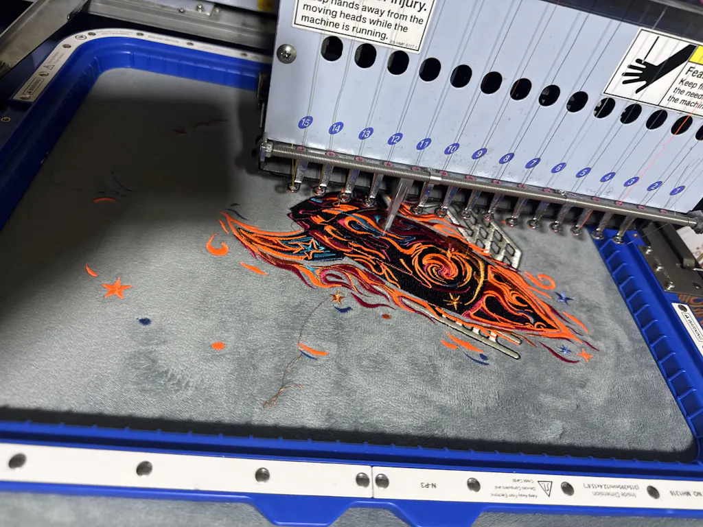
Magnetic hoops—like those from Sewtalent—are a game-changer for garment embroidery. They deliver even tension and secure grip, making it easier to achieve precise placement and reduce misalignment. Magnetic hoops also speed up the hooping process and minimize fabric damage, especially on thick or delicate materials.
Why it matters:
For businesses focused on efficiency and quality, investing in magnetic embroidery hoops can streamline production and improve consistency—helping every left chest logo look sharp and professional.
6. DIY Tools and Precision Methods
You don’t need a fancy workshop to get professional results. Whether you’re a hobbyist or a small-scale operator, these DIY tools and hacks will help you achieve spot-on left chest logo placement every time.
6.1 Measuring Hacks and Templates
Finger-Width Approximations: No ruler? No problem. Stack four fingers below the collar for a quick estimate of the standard 3–4 inch drop—perfect for adult tees. For kids’ shirts, two to three fingers (about 2–2.5 inches) does the trick.
Paper Mockups: Cut a piece of paper to the exact size of your logo, tape it to the shirt (on a person or mannequin), and adjust until it looks right. Once you’re happy, measure from the collar and center to lock in your placement for future runs.
Laser Alignment Examples: Magnetic embroidery hoops with laser alignment ensure pinpoint accuracy on varied sizes.
YouTube Tips:
- Fold your logo in half to create a crease for perfect centering.
- Use simple alignment jigs around the collar to keep things straight, especially when collars are off-center.
Workflow for Beginners:
- Lay the garment flat and align the bottom edge with your press or table.
- Use your chosen measurement method (fingers, ruler, or paper template).
- Double-check by eye or with a laser for accuracy.
- Mark the spot lightly with chalk or tape before pressing or embroidering.
6.2 Heat Press Accessories
Teflon Covers: Slip a Teflon cover over your heat press platen to protect it from adhesive, ink, and scorch marks. Teflon ensures even heat distribution and keeps your equipment clean—crucial for crisp, consistent transfers.
Platen Protectors: A Quick Slip Platen Protector not only shields your press but also makes it easier to slide garments on and off—speeding up production and reducing errors.
Power Platens: For those ready to invest a bit more, Hotronix Power Platens offer top-and-bottom heating, making it easy to apply thick or dimensional logos accurately. Interchangeable platens let you adapt to different garment sizes and styles without buying a new press.
Pro Tip: For most left chest logos, a 6x6 inch platen is ideal—big enough for the design, small enough to avoid seams and buttons.
In summary: Consistent, professional left chest logo placement is within reach for everyone. With a few clever hacks, the right tools, and a commitment to accuracy, you can turn every garment into a brand ambassador—no matter your budget or experience level. Ready to take your logo placement from “good enough” to gallery-worthy? Grab your ruler (or your fingers), fire up the heat press, and let your creativity shine!
7. Conclusion: Mastering Professional Placement
Consistency is the secret sauce behind every polished, professional left chest logo. Whether you’re working with T-shirts, polos, hoodies, or youth garments, the formula remains the same: measure with intention, adapt for each garment, and double-check your work. Stick to the industry’s golden rules—3–4 inches down from the collar, 4–6 inches from the center, and a logo width of 3–4 inches—and you’ll sidestep the most common pitfalls, from armpit drift to off-center mishaps.
But don’t stop at the numbers. Use anchor points like collar and shoulder seams, leverage simple tools (rulers, finger-widths, paper mockups), and always view your placement on a real body or mannequin. Mistakes? They’re just part of the journey—fix them with the right techniques and keep learning.
Remember, every perfectly placed logo is a mini billboard for your brand. Nail the details, and your garments won’t just look good—they’ll elevate your business, boost recognition, and keep customers coming back for more.
8. FAQ: Left Chest Logo Placement
8.1 Q: What is the standard size for a left chest logo?
A: The industry standard for a left chest logo is typically 3 to 4 inches wide. For adult T-shirts and polos, 3.5" x 3.5" is a popular choice. Youth and toddler sizes should scale down to 2–2.5 inches wide for a balanced look. ---
8.2 Q: How far down from the collar should I place the logo?
A: For most adult garments, position the top of the logo **3–4 inches down from the collar seam**. Hoodies and sweatshirts may require a slightly lower placement (4–5 inches) to account for fabric bulk and hood coverage.
8.3 Q: How far from the center should the logo be placed?
A: The sweet spot is **4–6 inches from the center** of the garment. This keeps the logo visible and prevents it from drifting toward the armpit.
8.4 Q: Do I need to adjust placement for different garment types?
A: Yes! While the basic guidelines work for most shirts, adjust for garment style and size. For women’s shirts, raise the logo about 1 inch higher. For youth and toddler garments, use smaller logos and adjust the placement upward to avoid the armpit area.
8.5 Q: What tools can help me achieve consistent placement?
A: Use rulers, finger-width hacks (four fingers ≈ 3 inches), paper mockups, and laser alignment tools for repeatable accuracy. Placement templates and visual checks on a mannequin or person are also highly recommended.
8.6 Q: Does fabric type affect logo placement?
A: Absolutely. Thicker or bulkier fabrics (like hoodies) may require larger logos and slightly lower placement. Always pre-press garments to remove wrinkles and test placement visually before final application.
8.7 Q: What’s the best way to check if my logo is centered and straight?
A: Align the logo using the collar/shoulder seam as your vertical anchor and measure from the center for horizontal accuracy. Always double-check by eye—what looks right flat may shift when worn, so use a mannequin or try it on if possible.
8.8 Q: Can I use the same placement for screen printing, heat transfer, and embroidery?
A: Yes, the placement guidelines are generally universal. However, embroidery may need extra attention to fabric tension and thickness. For embroidery, use proper hooping techniques to avoid puckering or misalignment.
8.9 Q: How can I fix a logo that’s been placed incorrectly?
A: For heat transfers, reapply heat or use acetone to remove and reposition. For professional fixes, visit embroidery machine repair near me specialists for realignment.
8.10 Q: Why is left chest placement so popular for branding?
A: The left chest is highly visible during conversation and interaction, making it ideal for logos, uniforms, and promotional apparel. It’s subtle yet professional—perfect for boosting brand recognition without overpowering the garment.
Still have questions? Experiment, measure twice, and trust your eye—mastery comes with practice and attention to detail. Happy decorating!