1. Introduction to Embroidered Lettering
embroidery professional machine transform everyday objects into cherished keepsakes. Whether it’s a child’s name on a quilt, an inspiring quote on a tote, or elegant initials on a crisp linen napkin, embroidered lettering infuses your work with meaning and artistry. In this guide, we’ll explore the essential techniques for stitching names by hand—covering foundational stitches, material selection, and expert tips for both block and script fonts. We’ll also preview how machine digitizing and commercial approaches can elevate your lettering to professional levels. From the first stitch to the final flourish, mastering the right tools and methods will ensure every letter you embroider stands out with clarity and style.
Table of Contents
- 1. Introduction to Embroidered Lettering
- 2. Essential Hand Embroidery Stitches for Names and Letters
- 3. Choosing Optimal Stitches for Different Font Styles
- 4. Material Selection for Durable and Beautiful Lettering
- 5. Pattern Transfer Methods for Flawless Letter Alignment
- 6. Troubleshooting Common Letter-Embroidery Issues
- 7. Machine Embroidery Techniques for Professional Name Digitizing
- 8. Commercial Applications: High-Volume Name Embroidery
- 9. Conclusion: Elevating Your Embroidery Name Projects
- 10. FAQ: Embroidered Lettering Essentials
2. Essential Hand Embroidery Stitches for Names and Letters
Hand-embroidered names and letters can be as bold or delicate as your imagination allows. The magic lies in choosing the right stitch for your font and fabric, then adapting your technique for curves, corners, and varying line thicknesses. Let’s break down the most effective stitches for lettering, drawing on expert advice and hands-on tutorials.
2.1 Backstitch: Precision for Block Fonts
The backstitch is a cornerstone of embroidered lettering, prized for its crisp lines and control—especially when working with block or sans-serif fonts. Here’s how to achieve sharp, professional results:
Step-by-Step Backstitch Guide:
1. Start: Bring your needle up at the start of your letter.
2. First Stitch: Insert the needle about 1/4 inch ahead, then pull through.
3. Continue: For each new stitch, bring the needle up ahead of the previous stitch’s end, then insert it back into the end of the last stitch. This creates a continuous, solid line.
4. Repeat: Move backward along the letter’s outline, keeping stitches even.
Expert Tips:
- Fabric Tension: Keep your fabric taut in the hoop to prevent puckering and ensure smooth lines.
- Strand Adjustments: Use 2–4 strands of embroidery floss for block letters—fewer for fine lines, more for bold impact.
- Curves & Angles: Shorten your stitches on tight curves or sharp corners for a smoother appearance. On angular letters, plan your stitch path to avoid doubling over lines, which can look bulky.
- Thread Management: On light fabrics, avoid trailing thread between letters; instead, end and restart your thread to prevent unsightly shadows.
From the Pros:
YouTube tutorials and top embroidery blogs agree—backstitch is reliable for both outlining and filling thicker letter sections. For bolder fonts, outline the thick parts with backstitch, then fill them in with additional rows, varying stitch length as you move from thin to thick areas. This layering technique creates a dimensional, polished look.
| Stitch | Texture | Best Use Case | Difficulty |
|---|---|---|---|
| Backstitch | Bold, dashed line | Block letters, straight lines | Easy |
| Stem Stitch | Twisted, rope-like | Cursive, curves, stems | Moderate |
| Split Stitch | Braided, plaited | Thin lines, calligraphy | Moderate |
| Chainstitch | Bold outlines | Chainstitch embroidery machine techniques create bold outlines. | Moderate |
2.2 Stem & Split Stitch: Mastering Curves and Script
When your design calls for flowing script or intricate curves, stem and split stitches are your best friends.
Stem Stitch for Cursive Fonts:
- Start: Bring thread up at the start of the letter.
- First Stitch: Make a small stitch, then bring the needle up next to (not through) the previous stitch.
- Loop Formation: Always keep the working thread on the outside of the curve for a natural, rope-like flow.
- Repeat: Continue with consistent stitch lengths, adjusting as you navigate curves.
- Corners: For sharp angles, end your line and restart with a backstitch for a clean transition.
Split Stitch for Delicate, Braided Lines:
- Start: Bring thread up at the start point.
- First Stitch: Make a small stitch, then bring the needle up through the center of the previous stitch, splitting the floss.
- Repeat: Continue splitting each stitch for a seamless, plaited effect.
- Visibility: For the cleanest results, work from the underside when possible.
Texture and Technique:
- Stem stitch creates a smooth, twisted look—perfect for cursive and italic fonts.
- Split stitch offers a subtle, braided texture, ideal for fine lines and calligraphy.
- Both stitches benefit from shorter lengths on curves and longer ones on straight sections.
YouTube Insights:
Stitch direction matters! Always “stitch like you write”—follow the natural flow of the letter, overlapping lines where your handwriting would. Adjust stitch length for tight curves, and don’t be afraid to experiment with combining stitches for unique textures.
Pro Tip:
There are no hard rules—only preferences. Try different stitches, strand counts, and techniques to discover your signature style.
3. Choosing Optimal Stitches for Different Font Styles
Selecting the right stitch for your font isn’t just about aesthetics—it’s about legibility, texture, and the story you want your letters to tell. Let’s explore how to match stitches to font personalities and manage threads for maximum visual impact.
3.1 Matching Stitches to Font Personalities
Font style, letter thickness, and project requirements all influence your stitch choice. Here’s a quick-reference guide:
| Stitch | Best For | Key Characteristics | Font Style Suitability | Thread Recommendations |
|---|---|---|---|---|
| Backstitch | Outlines, printed fonts | Bold, visible lines; easy for straight/angles | Block, sans-serif | 1–2 strands for thin lines |
| Split Stitch | Smooth curves, cursive | Seamless, textured line; great for flowing forms | Cursive, handwritten | 1–2 strands for detail |
| Stem Stitch | Cursive, slanted, bold | Rope-like, handles tight curves/corners | Script, italic, decorative | 2–3 strands for bold lines |
| Chain Stitch | Bold, thick outlines | Chain-like texture; fills large areas | Block, bold typography | 3–6 strands for thickness |
| Running Stitch | Quick outlines, thin | Simple, minimal texture | Minimalist, thin fonts | 1 strand for delicacy |
Font Style Recommendations:
- Cursive/Script: Stem or split stitch for fluidity and elegance.
- Block/Printed: Backstitch or chain stitch for strong outlines.
- Italic/Slanted: Stem stitch for angled lines.
- Minimalist: Running stitch for subtlety.
Google’s Top Advice: Keep it simple for small text—complex stitches can overwhelm tiny letters and reduce legibility. Always test your chosen stitch on a sample before committing.
3.2 Thread Management for Visual Impact
The number of floss strands you use dramatically affects your lettering’s look. Here’s how to tailor your thread choices:
- Thick Letters: Use 3–6 strands with chain or satin stitches for bold, filled-in letters.
- Thin Letters: Opt for 1–2 strands with back, split, or stem stitches for fine, crisp lines.
- Texture Play: More strands create a chunkier, more textured appearance; fewer strands yield a delicate, minimalist effect.
- Color Transitions: Variegated threads add gradient effects—perfect for artistic, eye-catching names.
YouTube Wisdom: Adjust your strand count and stitch type to match the font’s personality. For minimalist fonts, a single strand and running stitch create understated elegance. For decorative or statement fonts, layer stitches and experiment with color for dramatic flair.
Pro Tips for Flawless Results:
- Shorten stitches on tight curves for smooth lines.
- Plan your stitch path to avoid overlapping and bulk.
- Divide complex letters (like “p” or “m”) into separate stitch paths for precision.
---
Ready to take your embroidered names to the next level? Experiment with these stitches, play with thread thickness, and let your creativity flow. The perfect combination of technique and personal touch will turn every name you embroider into a work of art.
4. Material Selection for Durable and Beautiful Lettering
When it comes to embroidered names and lettering, your choice of thread and fabric is just as crucial as your stitch technique. The right combination ensures your work not only looks stunning but stands the test of time—whether you’re personalizing a denim jacket, monogramming a silk scarf, or adding a name to a cherished quilt. Let’s dive into the essential factors for selecting threads and fabrics that deliver both beauty and durability.
4.1 Thread Types: Cotton vs. Silk Showdown
Choosing between cotton floss and silk thread is a classic embroidery dilemma. Each brings its own flair, feel, and functionality to your lettering. Here’s how they stack up:
| Factor | Cotton Floss | Silk Threads |
|---|---|---|
| Strand Count | 6 strands (adjustable) | Single-strand (non-divisible) or spun silk |
| Sheen | Soft, matte | High, luxurious |
| Durability | High (resists washing/pilling) | Moderate (prone to wear) |
| Best Use | Bold letters, textured designs | Fine details, elegant scripts |
| Cost | Affordable (e.g., DMC, Anchor) | Premium (e.g., Pipers, Au Ver a Soie) |
Cotton Floss (Stranded Cotton):
- Versatility: Easily split into 1–6 strands, making it suitable for both fine details and bold, chunky letters.
- Affordability & Availability: Widely accessible, with a rainbow of colors from brands like DMC and Anchor.
- Durability: Stands up to frequent washing, resists pilling, and is a go-to for everyday items.
- Texture: Matte finish, slightly less sheen than silk, and may not lie as flat on certain fabrics.
- Ideal For: Sturdy fabrics like linen, denim, or cotton—think tote bags, jackets, or quilt labels.
Silk Threads:
- Sheen & Elegance: The high luster of silk brings a luminous, luxurious look to your letters—perfect for special gifts or heirlooms.
- Detail Work: Available in ultra-fine filament silk for intricate scripts or spun silk for a slightly heavier feel.
- Cost & Care: More expensive and delicate than cotton; best reserved for projects where elegance is the priority.
- Durability: Less resistant to abrasion and repeated washing; hand-wash recommended to preserve color and sheen.
- Ideal For: Delicate fabrics like silk or satin—think monogrammed scarves, pillowcases, or wedding accessories.
Pro Tips from the Pros and YouTube Insights:
- Experiment with Strand Counts: Use 1–2 strands of cotton for small, delicate letters; 3–6 strands for bold, statement fonts. Silk’s smoothness means even a single strand can look rich and vibrant.
- Mix for Effect: Want the best of both worlds? Outline with cotton for durability, then fill with silk for a pop of shine.
- Dark Fabric Solutions: For dark or textured fabrics, both cotton and silk can work, but silk’s sheen often stands out more. Magnetic machine embroidery hoops with stabilizers prevent puckering and keep your stitches crisp.
4.2 Fabric Compatibility and Care Strategies
Your fabric choice can make or break the look and longevity of embroidered names. The secret? Pairing the right thread with the right fabric, and knowing how to care for your masterpiece.
Fabric-Thread Pairings:
- Cotton Floss:
- Best With: Cotton, linen, canvas, and denim. These fabrics hold up well to the slightly firmer texture of cotton floss.
- Example: Embroidering names on denim jackets, tote bags, or linen napkins.
- Silk Threads:
- Best With: Silk, satin, voile, or other delicate, tightly woven fabrics. Silk thread glides smoothly and won’t distort these sensitive materials.
- Example: Monograms on silk scarves or satin pillowcases.
Care and Durability:
- Cotton Floss:
- Washing: Machine washable, resists fading and pilling—ideal for items that see regular use.
- Shrinkage Prevention: Pre-wash your fabric and use a stabilizer to avoid puckering, especially on natural fibers like linen.
- Silk Threads:
- Washing: Hand-wash only, using cold water and gentle detergent. Silk can bleed or lose its sheen if exposed to harsh conditions.
- Fade Resistance: Store silk-embroidered items away from direct sunlight to prevent color loss.
YouTube Shrinkage Tips: Always pre-wash and iron your fabric before stitching, especially if you plan to wash the finished piece. This prevents unwanted shrinkage and keeps your letters looking sharp.
Google’s Top Advice: For dark fabrics, use a water-soluble stabilizer to transfer your pattern and prevent thread colors from bleeding. Linen is a favorite for its stability and classic look, but always test your thread and fabric combo on a scrap before starting your main project.
Quick Reference Table: Fabric and Thread Pairings
| Fabric Type | Recommended Thread | Notes |
|---|---|---|
| Cotton | Cotton floss | Durable, easy to stitch, machine-wash |
| Linen | Cotton floss | Stable, vintage look, pre-wash advised |
| Denim | Cotton floss | Use larger needle, bold letters |
| Silk | Silk thread | Elegant, handle with care, hand-wash |
| Satin | Silk thread | For monograms, avoid heavy stitches |
| Voile | Silk thread | Lightweight, delicate, use fine needle |
Final Thought: Matching your thread and fabric isn’t just about durability—it’s about achieving the look and feel you envision. Don’t be afraid to experiment. Sometimes, the most memorable pieces come from unexpected combinations.
5. Pattern Transfer Methods for Flawless Letter Alignment
Perfectly aligned letters start long before the first stitch. The method you use to transfer your pattern can mean the difference between crisp, professional-looking names and wobbly, uneven lines. Let’s break down the top techniques for getting your lettering onto fabric with accuracy and ease.
Light Table Method
Overview: A classic for good reason, the light table (or even a sunny window) lets you trace your design directly onto light-colored fabrics with precision.
How-To:
- Tape your printed pattern to the light source.
- Secure your fabric over the pattern, centering your design.
- Use a water-soluble or friction pen to trace every line.
- Double-check your work by turning off the light before removing the fabric.
Pros:
- High accuracy for intricate or script fonts.
- No special equipment needed—just a window will do.
- Great for reusable patterns.
Cons:
- Limited to lighter fabrics; marks may not show on dark materials.
- Requires a steady hand and flat workspace.
Water-Soluble Stabilizers
Overview: Adhesive-backed stabilizers that dissolve in water—no tracing required! Perfect for beginners or complex designs.
How-To:
- Draw or print your letter pattern onto the stabilizer.
- Stick the stabilizer to your fabric.
- Stitch through both layers.
- Rinse away the stabilizer after you finish.
Pros:
- Works on any fabric color, including darks.
- No risk of smudging or fading lines during stitching.
- Reduces waste with reusable options.
Cons:
- May not suit very large or intricate designs.
- Requires purchasing stabilizer sheets.
Water-Soluble Pens
Overview: Quick and portable, these pens let you sketch your design directly onto fabric.
How-To:
- Trace your pattern onto the fabric using the pen.
- Stitch over the lines.
- Remove marks with water or by ironing.
Pros:
- Fast for small projects.
- No extra tools needed.
Cons:
- Marks may fade during stitching.
- Harder to see on dark or textured fabrics.
Method Comparison Table
| Method | Best For | Fabric Compatibility | Reusability | Skill Level |
|---|---|---|---|---|
| Light Table | Intricate lettering | Light-colored fabrics | High | Intermediate |
| Water-Soluble Stabilizer | Beginners, dark fabrics | All fabrics | Moderate | Beginner |
| Water-Soluble Pens | Quick projects | Light/medium fabrics | Low | Beginner |
Additional Techniques:
- Heat Transfer Pens/Pencils: Trace in reverse and iron onto fabric. Best for natural fibers, but may not show on darks.
- Carbon Paper: Place under fabric, trace with a pen. Traditional, but requires gentle pressure to avoid fabric damage.
Pro Tips from Google and YouTube:
- For dark fabrics, water-soluble stabilizers are a game-changer—no more squinting to see faint lines.
- Always test your transfer method on a scrap first, especially with heat or water-soluble products.
- For complex scripts, the light table gives the most control over curves and flourishes.
Key Takeaway: Choose your transfer method based on fabric color, design complexity, and your comfort level. A little prep goes a long way toward flawless, professional-looking embroidered names.
6. Troubleshooting Common Letter-Embroidery Issues
Even seasoned embroiderers run into snags—literally and figuratively. From shredded thread to bumpy curves, these common problems can turn a joyful project into a test of patience. But don’t worry: with a few smart fixes, you’ll keep your stitches (and your sanity) intact.
6.1 Solving Thread Shredding and Uneven Curves
Thread Shredding: Causes & Solutions
1. Dull or Damaged Needles:
- Needles develop tiny burrs over time, which can fray or break your thread.
- Fix: Replace needles every 1–2 projects or after about 8 hours of stitching. Use embroidery-specific sizes (e.g., 75/11 or 90/14 for thicker threads).
| Fabric Type | Stabilizer Choice | Why It Works |
|---|---|---|
| Knits | Cut-away + adhesive spray | Prevents stretch distortion |
| Silk | Water-soluble film | Dissolves without residue |
| Leather | Tear-away + masking fabric | Cushions without sticking |
2. Incorrect Needle Orientation:
- Backwards needles disrupt thread flow.
- Fix: Ensure the groove faces you and the scarf faces away (toward the back of the machine or your hand).
3. Thread Quality & Storage:
- Old, brittle, or poorly stored thread is more likely to snap.
- Fix: Store thread in sealed bags, use moisture-resistant types, and consider silicone lubricants for metallics. Maintain a bit of humidity in your workspace.
4. Machine Settings:
- High speed or improper tension can stress threads.
- Fix: Slow down for delicate threads and adjust bobbin tension only as a last resort.
Uneven Curves & Stitch Path Issues
- Inconsistent Stitch Length:
- Long stitches on curves create jagged, angular letters.
- Fix: Use shorter stitches (≤3 mm) for tight curves and corners. For sharp angles, treat them as separate segments.
- Overlapping Stitch Paths:
- Retracing lines (like in handwriting) causes bulk and unevenness.
- Fix: Plan a single-lane stitch path—split complex letters (like “p” or “m”) into non-overlapping segments.
- Digitizing Errors (for machine embroidery):
- Missing lock stitches or incorrect jump settings can leave messy threads.
- Fix: Insert lock stitches at the start of each segment and trim excess jump stitches carefully.
YouTube Wisdom: Check your entire thread path—from spool to needle—to spot where shredding occurs. Sometimes, a burr on the needle plate or bobbin case is the hidden culprit.
6.2 Reducing Bulk in Tight Spaces
Why Bulk Happens:
- Overlapping Stitches: Large or retraced stitches pile up, especially in corners.
- Loose Fabric: Slack fabric allows thread to bunch up.
- Thread Thickness: Heavy threads in small spaces add unnecessary bulk.
How to Fix It:
- Use Smaller Stitches: In tight corners, keep stitches ≤2 mm and avoid retracing paths.
- Keep Fabric Taut: Always hoop your fabric tightly to prevent puckering. (For curved items, use specialized frames.)
- Match Needle to Thread: Pair thick threads with larger needles (e.g., 90/14) to reduce friction and bulk.
Path-Planning Solutions: Break down complex letters into logical segments. For example, stitch the vertical and loop of a “p” separately, so you’re not doubling over the same spot.
Proactive Maintenance:
- Thread Path Management: Place spools in cups to minimize kinks. Use anti-static sprays or dryer sheets to reduce thread cling.
- Machine Hygiene: Clean your bobbin area and tension discs regularly.
- Foot Height: Adjust the embroidery foot to prevent fabric drag.
Final Thought: Every embroidery hiccup is a chance to level up your skills. With a bit of troubleshooting and the right techniques, even the trickiest letters will come out looking crisp and professional.
Ready to create embroidered names that are as durable as they are beautiful? With the right materials, transfer techniques, and a few troubleshooting tricks up your sleeve, your next project is sure to shine.
7. Machine Embroidery Techniques for Professional Name Digitizing
Machine embroidery has revolutionized the way we personalize garments, uniforms, and gifts with names and monograms. But achieving crisp, readable lettering—especially at small sizes—demands more than just loading a font and pressing “start.” Let’s break down the best practices for digitizing fonts and optimizing your machine setup for flawless results.
7.1 Font Digitization Best Practices
Digitizing names for embroidery is both an art and a science. The process starts with converting your chosen font into a vector file (like SVG or EPS), ensuring every curve and corner is captured with precision. This vector foundation is crucial—especially when you need to scale your design. Pro tip: Design your text at a large size (say, 14 inches), then scale it down to your target size (like 4 inches). This approach helps prevent distortion and maintains stitch stability, even for the tiniest letters.
Font Selection Matters: For small text (under 4mm tall), sans-serif fonts are your best friend. Their clean, simple shapes stitch beautifully and avoid the pitfalls of narrow serifs or complex scripts, which can quickly turn into a tangled mess of thread. When working with larger letters, satin columns create smooth, professional edges, while fill stitches add boldness and stability to your design.
Software Workflow: The best digitizing software for embroidery streamlines workflows. Import your font into embroidery software—whether it’s a powerhouse like Ink/Stitch or a graphics tool like Adobe Photoshop. Adjust the size and format as needed, but always test your design before finalizing. Auto-digitized fonts (like TrueType) often generate illogical stitch paths, so don’t be afraid to roll up your sleeves and manually edit complex letters (the letter “t” is a classic troublemaker). Proprietary fonts included in embroidery software, such as those from Floriani, may offer smoother stitching but can be limiting if you crave versatility.
Stabilizer Selection: Don’t overlook the stabilizer! For small text, a reliable stabilizer—like those compatible with Sewtalent hoops—keeps your fabric taut and your stitches crisp. Tear-away or cut-away stabilizers are essential for preventing puckering and distortion, especially on stretchy or delicate fabrics.
| Factor | Recommendation |
|---|---|
| Font Type | Sans-serif for small text (<4mm) |
| Stitch Type | Satin columns for edges, fill for bold letters |
| Auto-Digitized Fonts | Manual editing often required |
| Software Fonts | Proprietary fonts stitch well, less versatile |
| Stabilizer | Use for small text, choose based on fabric |
Key Takeaway: Great machine-embroidered names start with thoughtful digitizing. Prioritize clean, scalable fonts, test your designs, and don’t hesitate to tweak stitch paths for perfection.
7.2 Optimizing Machine Settings with Magnetic Hoops
Once your design is ready, it’s time to set up your embroidery machine for success. Here’s where the right hoop—and the right settings—make all the difference.
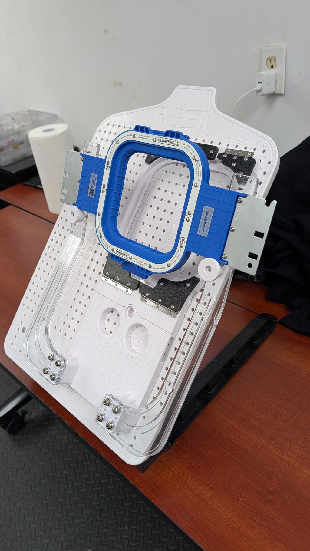
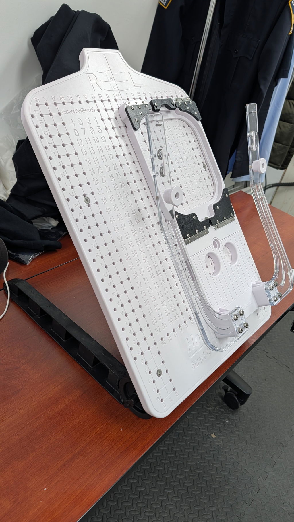
Tension Adjustments for Thick Fabrics: Thick fabrics like denim, sweatshirts, or multi-layered garments can challenge even the most seasoned embroiderer. With Sewtalent magnetic embroidery hoops, you get automatic adaptation to varying fabric thicknesses. The powerful magnetic clamping system holds everything securely, so you can focus on dialing in your machine’s tension for flawless stitches. No more wrestling with screws or worrying about hoop burn—just smooth, even tension every time.
Speed and Efficiency: Here’s where magnetic hoops truly shine: hooping with Sewtalent is up to 90% faster than with traditional screw-based systems. Imagine reducing your hooping time from three minutes to just thirty seconds per garment. That’s not just a time-saver—it’s a game-changer for anyone running high-volume jobs or tight deadlines.
Why Magnetic Hoops?
- Even Tension: The textured, broad contact area keeps fabric flat and secure.
- No Hoop Marks: Magnetic force distributes pressure evenly, protecting your finished piece.
- User-Friendly: Quick installation and removal spare your hands and wrists from repetitive strain.
Note: Sewtalent hoops are designed for garment embroidery, not for caps or hats.
Action Step: If you’re tired of slow, fiddly hooping and want to boost your shop’s productivity, consider upgrading to Sewtalent magnetic hoops. Their compatibility with most commercial machines and superior ease of use make them a smart investment for any embroidery business.
8. Commercial Applications: High-Volume Name Embroidery
In the world of commercial embroidery, efficiency and consistency aren’t just nice-to-haves—they’re the keys to profitability. Whether you’re outfitting a corporate team or producing a thousand promotional totes, industrial embroidery machines enable high-volume production.
8.1 Efficiency Strategies for Uniforms and Promotional Items
The embroidery market is booming, with global revenues projected to soar from $2.73 billion in 2022 to $5.72 billion by 2028. In the U.S. alone, commercial embroidery services are a billion-dollar industry, driven by demand for branded uniforms and promotional gear.
Uniforms: Personalized embroidery on uniforms does more than just look sharp—it fosters team spirit and turns every employee into a walking billboard for your brand.
Promotional Products: Embroidered hats, bags, and apparel deliver long-lasting brand exposure at a fraction of the cost per impression compared to digital or print ads. In fact, embroidery accounts for over 40% of global custom apparel revenues.
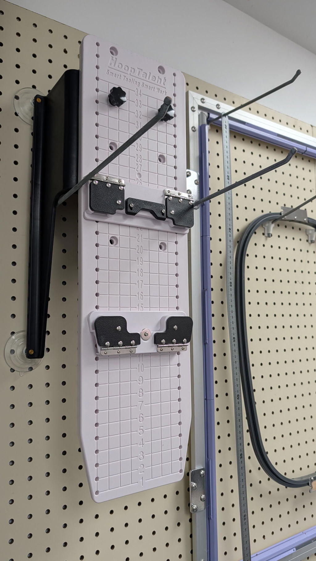
Batch Processing with Sewtalent Hoops: Here’s where the magic happens for high-volume jobs: Sewtalent magnetic hoops, paired with the HoopTalent station, streamline batch processing. The combination allows for rapid, repeatable fabric placement and hooping—cutting labor time and reducing errors. Operators can process dozens of garments in the time it used to take for just a handful, making it easier to scale up for big orders without sacrificing quality.
Key Efficiency Drivers:
- Auto-tensioning: Ensures every stitch is consistent.
- Intuitive Controls: Reduce training time for new staff.
- Advanced Sensors: Optimize alignment for complex logos and names.
Pro Tip: If you’re looking to boost ROI, investing in efficient hooping systems and automation tools is the fastest way to scale your embroidery business and outpace the competition.
8.2 Cost Analysis: Long-Term Savings with Durable Tools
Let’s talk numbers. In commercial embroidery, every minute saved and every tool that lasts longer directly impacts your bottom line.
Durability That Pays Off: Sewtalent hoops are engineered for industrial-grade longevity—lasting up to 40 times longer than traditional plastic hoops. That means fewer replacements, less downtime, and more money in your pocket over the long haul.
Annual Labor Savings: By slashing hooping time by 90%, Sewtalent hoops can save an average shop more than $4,000 per year in labor costs alone. Multiply that by the number of machines or operators you have, and the savings add up fast.
| Feature | Sewtalent Magnetic Hoop | Traditional Plastic Hoop |
|---|---|---|
| Durability | 40x longer lifespan | Frequent replacements needed |
| Hooping Speed | 90% time savings | Slow, manual screw adjustments |
| Labor Cost Savings | $4,000+ per year | Higher ongoing labor costs |
| Fabric Protection | Even tension, less hoop burn | Prone to marks and misalignment |
| Batch Processing | Optimized with HoopTalent station | Manual, error-prone |
Bottom Line: Investing in durable, high-efficiency tools like Sewtalent hoops isn’t just about convenience—it’s a strategic move that delivers measurable returns, year after year.
9. Conclusion: Elevating Your Embroidery Name Projects
From selecting the perfect stitch and materials to mastering digitizing and machine setup, every detail matters when it comes to embroidered names. The right tools—like Sewtalent magnetic hoops for garments—don't just save time; they prevent costly errors and elevate the quality of your work.
As you experiment with new techniques and technologies, remember: the best results come from a blend of creativity, precision, and smart investments in your craft.
Ready to take your embroidery to the next level? Try out these strategies, and watch your name projects shine.
10. FAQ: Embroidered Lettering Essentials
10.1 Q: What is the best stitch for cursive or script lettering?
A: For cursive or script styles, the stem stitch is widely recommended thanks to its smooth, rope-like appearance and ability to flow gracefully around curves. Many embroidery artists also love split stitch for its braided texture and control on small, intricate scripts. Both stitches allow you to "write" with your needle, following the natural motion of handwriting. Remember to keep your stitches short on tight curves for the cleanest results. If you're after a particularly crisp, raised look, Quaker stitch (a hybrid of stem and split stitch) is another excellent choice, as it gives dimension and clarity to handwritten text.
10.2 Q: How do I avoid thread shadows between letters?
A: Thread shadows—those faint lines that show through from the back—can distract from otherwise beautiful lettering, especially on light-colored fabrics. To prevent them, always end your thread after finishing each letter and start fresh for the next, unless you're working with tiny, closely spaced letters or a true script where the letters naturally connect. If you must move from one section to another, weave your thread under the existing stitches on the back rather than trailing it across open fabric. This keeps the front of your work clean and professional, free of unwanted shadows.
10.3 Q: What fabric is ideal for beginners learning embroidered lettering?
A: Beginners will find the most success with medium-weight, tightly woven cotton or linen fabrics. These materials provide enough structure to support your stitches without puckering, yet aren't so dense that they're hard to work with. Cotton floss pairs perfectly with these fabrics, making it easy to practice different stitches and strand counts. If you're stitching on stretchy materials like t-shirts, be sure to use a stabilizer to prevent distortion. Pre-washing and ironing your fabric before starting will also help keep your letters crisp and prevent shrinkage later.
10.4 Q: How many strands of embroidery floss should I use for lettering?
A: The number of strands depends on the size and style of your letters. For fine, delicate lines or small fonts, use 1–2 strands for subtlety and control. For bold, statement letters or filled areas, 3–6 strands create more texture and visual impact. Always test on a scrap first to see how your chosen stitch and strand count look on your fabric.
10.5 Q: Which stitches work best for thick or bold letters?
A: For thick or bold letters, chain stitch and satin stitch are top choices. Chain stitch creates a textured, substantial outline that stands out, while satin stitch fills in large areas with a smooth, polished surface. You can also outline thick sections with backstitch and fill them in with additional rows or brick stitch for a dimensional effect. Adjust your thread thickness to match the scale of your letters for the best results.
10.6 Q: How do I keep my curves and corners looking smooth?
A: The secret to smooth curves is using shorter stitches as you navigate bends—think of each stitch as a tiny step along the curve. For sharp corners, treat each segment as a separate line, ending and restarting your stitch as needed. Planning your stitch path in advance helps avoid overlapping lines, which can cause bulk and unevenness.
10.7 Q: Can I use variegated or specialty threads for embroidered names?
A: Absolutely! Variegated threads add beautiful color transitions and visual interest to your lettering with minimal effort. Specialty threads like silk or metallics can elevate your work, but may require more care—silk offers a luxurious sheen, while metallics can be trickier to handle. Always test specialty threads on your chosen fabric and adjust your needle size if needed for smooth stitching.
10.8 Q: What's the easiest way to transfer a lettering pattern onto fabric?
A: The most beginner-friendly methods are using a light table (or sunny window) with a water-erasable pen for light fabrics, or a water-soluble stabilizer for dark or textured materials. Both approaches allow you to trace your design accurately and remove marks cleanly after stitching. Test your transfer method on a scrap to ensure it works well with your fabric and thread.
10.9 Q: How do I fill in large letters evenly?
A: Satin stitch is the classic choice for filling large letters, producing a smooth, glossy finish. For extra coverage or texture, try long and short stitch or brick stitch. Outlining the shape first with backstitch or split stitch can help maintain crisp edges and guide your fill stitches for a professional look.
10.10 Q: Are there any rules for hand-embroidered lettering, or can I mix techniques?
A: There are no hard-and-fast rules—only preferences and creative choices! Many artists mix stitches, thread types, and colors to achieve unique effects. The most important thing is to experiment and find what works for your style and project. Practice different combinations on scraps, and don't be afraid to break tradition to make your name embroidery truly your own.
Have a question not covered here? Drop it in the comments below—let's keep the conversation (and creativity) flowing!