1. Introduction: The Art and Science of Hoodie Design Placement
Ever wonder why some hoodies just look “right”—the logo, the artwork, the vibe? That’s no accident. Strategic design placement transforms a humble hoodie from a basic layer into a wearable billboard or a statement piece. Whether you’re an embroidery pro, a brand builder, or a creative enthusiast, mastering placement is your secret weapon for impact and professionalism.
In this guide, you’ll unlock the essential standards for hoodie design zones—front, back, sleeves, hood, and pockets—along with precise sizing recommendations and visual benchmarks. We’ll break down technical specs for embroidery, screen printing, and heat transfer vinyl, and walk you through step-by-step techniques for flawless, repeatable placement. You’ll also discover how fabric type, color, and texture influence your design’s visibility and longevity. Ready to elevate your hoodie game? Let’s dive in and turn every hoodie into a masterpiece of both art and science.
Table of Contents
- 1. Introduction: The Art and Science of Hoodie Design Placement
- 2. Hoodie Placement Zones: Location Standards and Sizing Guidelines
- 3. Technical Implementation: From Design to Precision Placement
- 4. Strategic Placement Choices: Branding, Aesthetics and Functionality
- 5. Advanced Applications and Cost Optimization
- 6. The Future of Hoodie Design: Technology and Trends
- 7. Conclusion: Placement as Strategic Brand Infrastructure
- 8. FAQ: Hoodie Placement Essentials
2. Hoodie Placement Zones: Location Standards and Sizing Guidelines
Designing a hoodie isn’t just about picking a cool graphic—it’s about knowing exactly where and how to place it for maximum effect. Let’s break down the most impactful placement zones and the sizing standards that will make your designs pop, whether you’re going bold or keeping it subtle.
2.1 Front Placement Mastery: Chest, Pocket and Zip-Up Strategies
Chest Placements: Left vs. Center
The center chest is the classic, attention-grabbing spot—think bold graphics, slogans, or statement artwork. Standard placement is 3 inches down from the collar (about four fingers’ width), ensuring balance and visibility. For adult hoodies, center chest designs typically range from 5–7 inches wide for standard looks and up to 8–10 inches for statement pieces. Youth and toddler sizes scale down accordingly, with recommended dimensions like 10.5" x 10.5" for youth medium/large, 8.5" x 8.5" for youth small, and 5.5" x 5.5" for toddlers.
The left chest placement is your go-to for subtle, professional branding—ideal for logos and corporate wear. The sweet spot is 5.5–8 inches down from the shoulder seam and 4–6 inches over from the center, naturally aligning over the heart. Standard left chest logos should be 3–4 inches wide for adults and youth, and 2.5 inches for toddlers.
Pocket Integration and Zip-Up Adaptations
Front pockets add a twist—designs must clear the pocket seam for clean visibility. For zip-up hoodies, avoid placing graphics directly over the zipper; instead, shift designs to one side or split them symmetrically for a balanced look. Always check how the design appears when zipped and unzipped to maintain integrity.
Visual Positioning Standards and Sizing Table
| Placement Location | Recommended Size | Positioning Guidelines | Typical Use |
|---|---|---|---|
| Left Chest | 3–4 inches | 4" below neckline, aligned with seam | Subtle branding, uniforms |
| Center Chest | 5–7 inches (std), 8–10" | 3" down from collar, centered | Bold branding, statement pieces |
| ≤3" x 3" | Above pocket seam | Small logos, accents |
For embroidery applications, ensure embroidery hoop sizes match design dimensions.
Common Mistakes to Avoid
- Too close to the neck: Always maintain at least 3 inches below the collar.
- Overlapping zippers or pockets: Shift or resize designs to avoid seams.
- One-size-fits-all: Scale artwork for each garment size to avoid oversized or undersized prints.
2.2 Back and Sleeve Canvas: Maximizing Impact Areas
Full Back and Upper Back Placements
The back of the hoodie is your largest canvas—perfect for intricate graphics or bold branding. For full back designs, position the top of the artwork 1–2 inches below the collar (or about eight fingers down from the top), ensuring visibility even when the hood is down. Standard adult full back sizes are 14" x 11.25", with youth sizes scaling down proportionally. Keep designs within 8–12 inches wide for balance and impact.
Upper back or yoke placements are ideal for text or smaller logos, sitting just below the neckline for subtle yet effective branding.
Sleeve Graphics
Sleeves are trending for modern, fashion-forward looks. Center the design along the sleeve seam for symmetry. For adults, sleeve graphics typically measure 12" wide x 4" high, while youth sizes use 10" x 2.5". For a subtle touch, keep sleeve designs 2–3 inches wide.
Sizing and Placement Table
| Placement Location | Recommended Size | Positioning Guidelines | Typical Use |
|---|---|---|---|
| Full Back | 8–12 inches wide | 1–2" below collar, centered | Large graphics, event branding |
| Upper Back/Yoke | 3–4 inches wide | Just below neckline | Subtle branding, text |
| Sleeve | 2–3 inches wide | Centered on sleeve seam | Modern, accent graphics |
Visibility Considerations
- Hood interference: Place back designs low enough to remain visible when the hood is down.
- Sleeve curvature: Adjust artwork for the sleeve’s natural curve, especially for elongated designs.
3. Technical Implementation: From Design to Precision Placement
Precision isn’t just for perfectionists—it’s what separates amateur from professional results. Here’s how to measure, center, and apply your designs for flawless hoodie customization.
3.1 Measurement Systems and Centering Techniques
Step-by-Step Measurement Guides
- Anatomical Reference Points: Use collar drops and shoulder seams as your starting lines. For center chest, measure 3 inches down from the collar; for left chest, use the seam intersection as your anchor.
- Finger-Width Technique: Four fingers below the neckline is a reliable visual cue for chest placement.
- Business Card Hack: A standard business card (3.5" x 2") is the perfect reference for left chest logo sizing.
Centering Strategies
- Mathematical Centering: Calculate centerlines using measurements for symmetry, especially on zip-up hoodies where the zipper can disrupt alignment.
- Visual Centering: Use transparent rulers, printable templates, or even a piece of string to mark the center before applying the design.
Garment-Specific Adaptations
- Zip-Up Hoodies: Adjust center chest placement to avoid the zipper; split designs if needed.
- Pullover Hoodies: More flexibility, but watch out for drawstrings and hood seams.
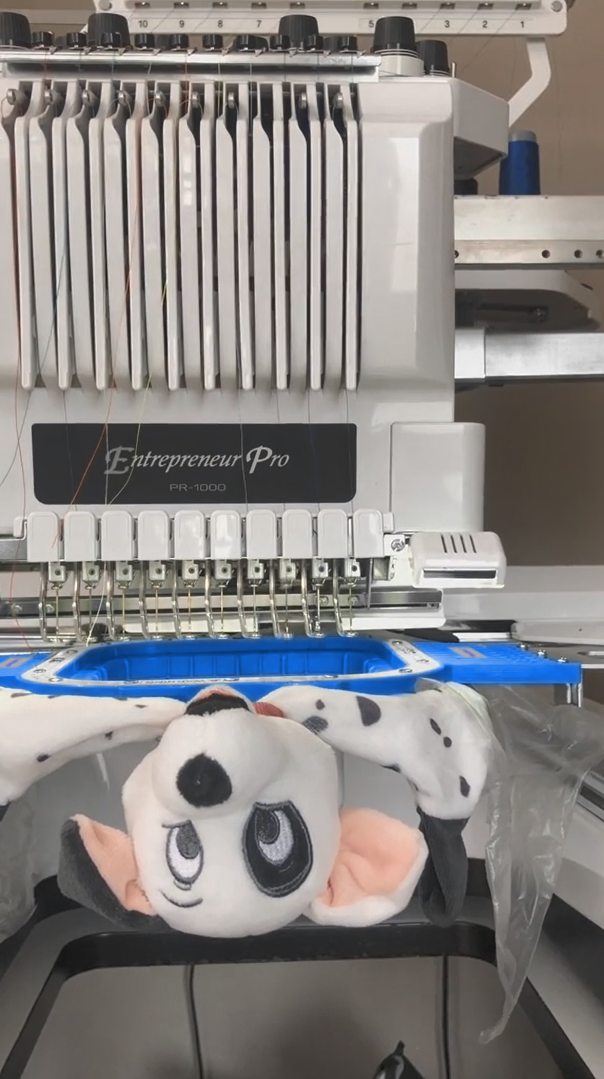
3.2 Material Science Meets Embroidery Precision
Fabric isn’t just a backdrop—it’s a co-star in your design’s performance. Different textures and weights can affect both the look and the longevity of your embroidery or print.
- Smooth Fabrics (Cotton, Polyester): Offer crisp, clear reproduction for both embroidery and printing.
- Textured or Heavy Fabrics (Fleece, Terry): May require simplified designs or bolder lines for visibility.
Pro Tip:
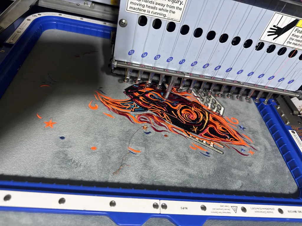
For embroidery, achieving even tension is essential to avoid puckering or distortion. This is where Sewtalent magnetic embroidery hoops shine. Their powerful magnetic system ensures the fabric is held securely and evenly, reducing hoop burn and making repeatable, professional results easy—even on thick or layered fabrics.
3.3 Error-Proof Workflows: Avoiding Hood and Pocket Disasters
Preventative Solutions
- Hood Coverage: Always check design visibility with the hood both up and down. Place back graphics at least 5 inches below the hood seam to keep them visible.
- Pocket Interference: For front designs, ensure artwork sits above the pocket seam—never overlapping.
- Zipper Conflicts: For zip-ups, avoid placing designs directly over the zipper; shift or split as needed.
Mockup Testing and Quality Control
- Digital Mockups: Use software like Canva or Photoshop to visualize placement before production.
- Physical Templates: Print designs at actual size, tape them to the hoodie, and assess from all angles.
- Final Checks: Use a lightbox or camera to confirm centering and alignment before final application.
By following these technical steps and leveraging the right tools, you’ll minimize errors and maximize the professional look of every hoodie you create.
4. Strategic Placement Choices: Branding, Aesthetics and Functionality
When it comes to hoodie design, placement is never just about where a logo lands—it’s about the message it sends, the vibe it creates, and the way it fits into a brand’s story. Let’s dig into the psychology and practicalities behind the most influential placement decisions, and explore how material choices can make or break your design’s impact.
4.1 Left Chest vs. Center Chest: The Brand Psychology
Think of the left chest placement as the quiet professional in the room—always present, never overpowering. This spot is the gold standard for subtle branding, favored by iconic names like Nike for its understated, trustworthy feel. The left chest is all about consistency and approachability. Logos here, typically sized at 3–4 inches wide, sit about 4 inches below the neckline and align with the shoulder seam, creating a look that’s polished and universally wearable. For women’s hoodies, nudging the logo an inch higher can help maintain visual harmony.
Why does this work so well? Because the left chest placement is instantly familiar. It’s where your eye expects to find a company badge or a team emblem. It’s the handshake of hoodie branding—reliable, discreet, and always in style. This placement shines in corporate settings, volunteer apparel, or anywhere subtlety and professionalism matter most. It’s also practical: the logo remains visible even when the hoodie is layered under a jacket or unzipped, making it a go-to for uniforms and events.
Now, swing to the center chest, and the story changes. This is the extrovert of hoodie placements—the bold, attention-grabber that refuses to be ignored. Supreme, for example, uses the center chest for maximum statement, turning their hoodies into walking billboards. Here, logos range from 5–7 inches wide for standard designs, up to 8–10 inches for those “can’t-miss-me” graphics. The center chest is all about impact, drawing the eye straight to the heart of the garment.
But with great power comes great responsibility. Center chest placements must be meticulously centered—typically 3 inches down from the collar—and carefully sized to avoid clashing with zippers or pockets. This is the space for brands that want to make an immediate impression, spark conversation, or showcase intricate artwork. It’s especially popular among younger, streetwear-savvy audiences who crave boldness and instant recognition.
So, which should you choose? If your brand is about trust, tradition, or corporate polish, the left chest is your best friend. If you’re chasing trendsetters, making statements, or launching limited-edition drops, the center chest is your stage. And remember, the best brands often mix it up—combining subtle left chest logos with dramatic back or sleeve prints for a layered, multidimensional look.
Comparative Placement Table
| Placement Type | Optimal Logo Size | Primary Use Case | Visibility Level | Professional Suitability |
|---|---|---|---|---|
| Left Chest | 3–4 inches wide | Subtle branding, uniforms | Consistent, moderate | High |
| Center Chest | 5–10 inches wide | Bold branding, statements | High impact, instant | Moderate |
4.2 Material-Driven Design: Color Contrast and Texture Compatibility
Fabric isn’t just a backdrop—it’s the stage, the lighting, and sometimes the star of your hoodie design. The interplay between material, color, and texture can turn a good design into a showstopper—or sink it into obscurity.
Start with color contrast. The rule is simple: opposites attract. Dark logos on light hoodies and vice versa create crisp, high-visibility results. If you’re working with a black or navy hoodie, opt for white, neon, or pastel logos to make your design pop. On the flip side, dark or vibrant logos look striking on heather gray, cream, or pastel bases. This isn’t just about aesthetics—it’s about making sure your logo is legible from across the room (or across the street).
Texture is where things get interesting. Smooth fabrics like cotton or polyester blends are your best friends for embroidery and print clarity. They let details shine and colors stay true. But when you venture into textured territory—think fleece, terry, or heavyweight knits—designs need to adapt. Fine lines and tiny text can get lost in the weave, so simplify your artwork and use bolder lines for maximum effect.
Weight matters too. Heavyweight hoodies can handle larger, more complex designs without sagging or warping, while lightweight styles benefit from smaller, less dense logos that won’t distort the fabric. Always test your design on a sample or mockup to see how it interacts with the material in real life.
Finally, don’t overlook the practical side: durability. Embroidery, screen printing, and heat transfer vinyl each have their own strengths and weaknesses depending on the fabric. Embroidery excels on thicker, stable materials, while prints might crack or fade on rough textures. Choose your technique to match your material—and always factor in how the hoodie will be worn, washed, and loved.
5. Advanced Applications and Cost Optimization
The hoodie world isn’t just pullover and zip-up anymore. Cropped, oversized, asymmetric—today’s styles demand creative placement strategies and a sharp eye on the bottom line. Let’s explore how to master these advanced applications and keep your production costs in check.
5.1 Non-Standard Hoodies: Cropped, Oversized and Asymmetric Solutions
Fashion-forward hoodies are rewriting the placement rulebook. Cropped hoodies, with their abbreviated torsos, shrink your canvas and force you to rethink proportions. Here, designs often need to be scaled down—aim for a 4-inch maximum for center chest embroidery—and placed higher on the chest to avoid getting lost near the hem. When paired with high-waisted bottoms, upper chest and shoulder placements become prime real estate for logos and artwork.
Oversized hoodies, on the other hand, are all about abundance. The extra fabric invites larger designs, but beware: drape and movement can obscure lower placements. Keep logos and graphics higher on the chest or shoulders for consistent visibility, and consider sleeve or upper back placements to maintain impact across layered looks.
Asymmetric designs throw symmetry out the window. Forget centering everything—these hoodies call for creative, off-balance placements that complement the garment’s unique lines. Visual harmony is key: balance bold graphics with negative space, and use logo placement to enhance—not fight—the hoodie’s natural flow.
Universal tips for non-standard styles? Hood and pocket placements remain flexible, but always adjust sizing and position to fit the garment’s unique proportions. Sleeve and back placements are your most reliable options, but scale designs up or down as needed to keep everything looking intentional and balanced.
5.2 Cost Intelligence: Balancing Aesthetics and Production Economics
Every placement choice comes with a price tag. Understanding the cost dynamics behind your design decisions is crucial—especially for brands and designers working on tight margins.
Let’s break it down:
- Single vs. Multiple Locations: Printing or embroidering in one spot (say, the left chest) keeps costs low. Add a back print, sleeve graphic, or hood detail, and your labor, setup, and material expenses climb fast.
- Design Complexity: Intricate embroidery with lots of colors or dense stitching? That’s more time and thread—meaning higher costs. Simple, high-contrast logos are not only easier on the eyes, but also on your budget.
- Production Method: Screen printing scales beautifully with volume—setup costs are spread across large orders, dropping your per-unit price. Embroidery, however, is labor-intensive and sensitive to placement complexity. The more locations you add, the more your costs multiply.
- Material Choices: Heavyweight, premium fabrics cost more upfront, but can elevate your brand and justify higher retail prices. Lighter blends are budget-friendly, but may limit your placement options or require design adjustments.
Here’s where precision tools like Sewtalent’s magnetic embroidery hoops come into play. By ensuring even tension and reducing hooping errors, they help cut embroidery defects by 15% and lower labor costs—making high-quality, multi-location designs more accessible, even for small-batch runs.
Optimization strategies? Focus on one or two high-impact placements, use bulk ordering to leverage economies of scale, and always match your design complexity to your production method and target audience. Remember: the most memorable hoodies aren’t always the most expensive—they’re the ones where every element, from placement to price, works in harmony.
6. The Future of Hoodie Design: Technology and Trends
Imagine being able to test your hoodie design placements in real time, on a virtual model, before a single stitch is sewn or a screen is burned. That’s not science fiction—it’s the next frontier in apparel design.
Traditional hoodie placement guides are rooted in static diagrams and fixed measurements. But today’s designers and consumers crave more: interactive, dynamic visualization that bridges the gap between concept and reality. Enter augmented reality (AR) and 3D mockup tools.
The AR try-on market is booming, with virtual fitting rooms projected to grow at over 24% annually through 2030. These technologies let users see how a logo or artwork will look on different body types, in various lighting, and across multiple hoodie styles. No more guesswork—just instant, personalized feedback.
Current solutions, like garment transfer systems and AR fashion platforms, can convert 2D designs into 3D experiences, allowing for real-time placement tweaks and even motion-activated effects. QR code integrations take it a step further, letting customers scan a code on the garment and see interactive overlays or animations.
Why does this matter? Because AR tools don’t just enhance design accuracy—they boost user engagement, confidence, and satisfaction. Brands can reduce costly sampling, speed up approval cycles, and offer customers a more immersive, memorable experience.
Of course, there are hurdles. Most AR platforms focus on consumer try-ons, not professional design workflows. Integrating these tools into traditional placement guides requires investment and a shift in mindset. But as the technology matures, expect to see hoodie design move from the static page to the interactive screen—making creativity, precision, and collaboration easier than ever.
The future of hoodie design is interactive, visual, and user-driven. Are you ready to step into it?
7. Conclusion: Placement as Strategic Brand Infrastructure
Design placement on hoodies isn’t just about aesthetics—it’s the backbone of your brand’s visual identity, production efficiency, and the garment’s real-world functionality. Every decision, from where you drop a logo to how you scale artwork for different sizes, shapes the story your hoodie tells and the impression it leaves.
Let’s distill the essentials:
- Brand Impact: Strategic placement amplifies brand recognition and message delivery, whether you’re aiming for bold statements or understated professionalism.
- Production Efficiency: Following placement standards minimizes costly errors—no more off-center logos, hidden artwork, or pocket mishaps.
- Garment Functionality: Proper sizing and positioning ensure comfort, wearability, and longevity, so your designs look great in real life, not just on screen.
Ready to elevate your hoodie game? Use this actionable checklist:
- Define your brand’s visual goals—subtle, bold, or somewhere in between.
- Choose placement zones based on garment style and target audience.
- Follow sizing guidelines for each print area—no one-size-fits-all shortcuts.
- Test placements with mockups and real samples before full production.
- Optimize for material and color contrast to maximize visibility.
- Review for functional issues—watch out for hoods, pockets, and zippers.
- Iterate and gather feedback to refine your approach for future drops.
With these principles, placement becomes a strategic asset—turning every hoodie into a canvas for your brand’s story, and every design into an experience people want to wear.
8. FAQ: Hoodie Placement Essentials
8.1 Q: How big should a logo be on a hoodie?
A: Logo size depends on placement and garment style. For left chest, 3–4 inches wide is standard; center chest logos typically range from 5–7 inches for a balanced look, scaling up to 8–12 inches for bold back or full-front designs. Always adjust for youth and toddler sizes to maintain proportion.
8.2 Q: What’s the best placement for a logo on a zip-up hoodie?
A: The safest options are either side of the chest, avoiding the zipper line. Split designs can also work—just ensure both halves align cleanly when zipped. Always check visibility with the hoodie zipped and unzipped.
8.3 Q: How do I optimize color contrast for maximum logo visibility?
A: Opposites attract! Use light logos on dark hoodies and vice versa. For textured or heathered fabrics, bold lines and simplified artwork help maintain clarity. Always preview your design on the actual garment color before production.
8.4 Q: Can I print or embroider on sleeves and hoods?
A: Absolutely. Sleeves are great for vertical graphics or secondary branding—stick to 2–3 inches wide for a balanced look. Hood prints are less common due to visibility issues but can make a unique statement if placed thoughtfully.
8.5 Q: How do I avoid common placement mistakes?
A: Use measurement guides and embroidery hoops for accuracy—like finger-width or ruler techniques—and always check for pocket, zipper, and hood interference. Test with digital or physical mockups before final production to catch errors early.
8.6 Q: What’s the best way to handle multi-location designs?
A: Prioritize one or two high-impact placements for cost efficiency and visual harmony. If you add multiple print zones (front, back, sleeve), ensure each is scaled and positioned for balance—don’t overcrowd the garment.
8.7 Q: My design looks different on various hoodie sizes. How do I fix that?
A: Scale artwork for each size category—what works for an adult large may overwhelm a youth small. Use size-specific templates and always test on real samples when possible.
8.8 Q: What’s the most important thing to remember about hoodie placement?
A: Placement is more than a technical step—it’s a strategic choice that shapes how your brand is seen, felt, and remembered. Take the time to plan, test, and refine. Your hoodies—and your audience—will thank you.